Large DOF

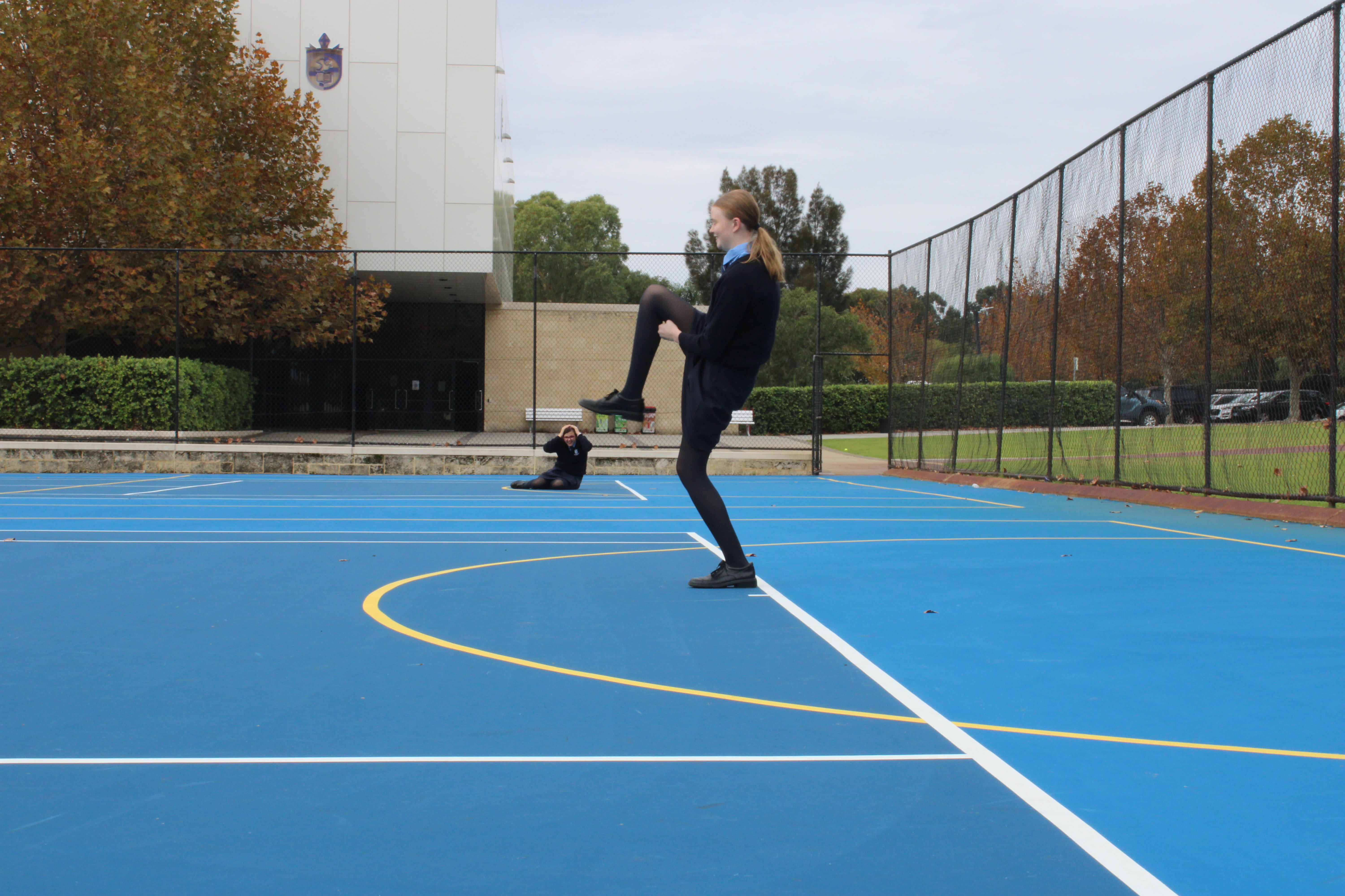
To get these photos we used a large depth of field and made the people stand far away to create a forced perspective. On the camera this meant setting our f-stop as small as it could go. The aim of these photos is to make funny situations by making people look smaller than they are in real life.

Some things I like about this photo is that the perspective actually looks right which is fairly hard to do with forced perspective photos. It howver could have been improved a bit by perhaps putting Sam farther back so it would be easier and more natural looking for Aleisha to step on her.

It would also have looked better if we took it on the oval because the lines on the court and the fence appearing smaller at the end show how we took the photo and it doesn’t have that surprise and mystery element.

Overall though I think we got a nice fun photo.

Mini People Photo

To take these photos we used a small f-stop so the objects closer to the camera were more clear and the background is blurry. We also used miniature people and objects to create interesting scenarios such as this one of the person coming out of the drain pipe on the canoe. We used plastic wrap to create the fake water coming out of the pipe.

I really liked this photo as it kind of mashes together something from normal life to a small person making it sort of fun and interesting. I love how cool it looks with the little canoe coming out of the drain pipe. I also think the blur in the background is quite nice and the rule of thirds used makes a nice composition.

One thing I would have changed is the background a little bit. While I do like how you can tell its a small person and the background places it in a more mundane normal location I would have preferred the background to be less distracting.

Light Graffiti Photo

I really love this photo.The lights give the model a very ethreal quality. It makes her look like a character in a fantasy novel with the wings, horns/ headress and also face made of light.

To improve this I would have liked the body to be darker so you could not see it at all and it would blend into the background. This would have created an even more mysterious quality. I could have done this by blacking out a bit more of the light and perhaps lowering ISO a bit. I would have also liked it if the headress wasn’t cut off at the top so you could have seen the whole thing.

Overall I really loved this photo and think it looks really amazing and quite different than other photos I am used to taking.

Levitation Photo

I really like the colours of this photo. The pastel and whimsical colours of the dress match with the deep emerald greens and pinks of the foliage in the background and give the photo a very magical sort of effect. I also like the story sort of aspect because with Sam being a fairy the levitation makes sense.

I don’t really like the shadows on the right as they are very obvious especially the one in the bottom right hand corner. They were much darker before though which detracted from the bright happy mood I intended the photo to have so I lightened just the shadows on Photoshop but it left a weird outline I couldn’t seem to get rid of. Another thing I would have changed is to raise the ISO a bit to give it more of a fairy/mystical effect.

Overall this photo is pretty good but with more Photoshop skills it could have been a bit better.

Capturing Kindness

I really like the colours in this photo. The common patterns between the mug and the plate create harmony and the hands handing the cup to the other person shows the caring and kindness that is the point of the photo. I like how the colour is only on the cookies and the cup and the hands of the person giving kindness to show how the kindness is being given and the colours are a symbol of that. It also roughly uses rule of thirds as the cup is in the top third and there is a plate of cookies in the bottom two thirds. The cup is on the right third and the other person is in the left third.

The only thing I would change is how busy the background is. I tried to blur it a bit to make it less attention grabbing but it’s still a bit unclear and doesn’t really have a focus point.

Overall though I think this is a pretty good photo.

Flat lay

Some things I like about this photo are the colours nd the composition. I like the contrast between the gold and the silver paper and objects of the opposite colour on each side. It makes it look a lot more harmonious. I also like the sort of theme as it is an artsy theme and I think the style of this photo fits that.

Some things I could improve are the light glare on the papers and on the sticker sheets. The glare makes it look not that great and the glare on the stickers is very distracting and detracts from the rest of the image. I would also add more space fillers if I did it again maybe some glitter or gems in either colour would be great or even pens.

Overall I really like the idea of this photo but I just think I could have implemented it a bit better.

Birds and Worms

Worm POV

I thought this was a really good picture of a worm POV photo. I really like the angle in this photo because it puts the people statues as tall and powerful. I also really like the colours and the contrast they create. The dark black of the statues against the grey and cloudy sky is very stark. I also like the bit of green from the tree in the corner for a bit of colour. It also uses the rule of thirds as the two front people are standing along the third lines. If I had to improve something I’d probably choose a different subject to more accurately portray the smallness of the worm.

Bird POV

I don’t really like this bird POV photo very much as its not very interesting. It was hard to get a birds eye photo in the school as there aren’t many tall areas or building as most of them are only one of two stories. I do like the colours though of the greens, red and the grey of the sky. I just think there’s too much going on. If I were to retake this photo I would probably stand on a balcony or next to a tall window and take a photo facing downwards making my subject something like a plant or tree.

Faceless Self Portrait

Our task was to take a faceless portrait. I decided to use a piece of bark to cover my face. I tried other things to cover my face with such as leaves and branches of trees and even my camera itself but I think this photo was the best.

I like the texture of the photo with the tree bark, the tree trunk being me and the greens in the background. I think they look really nice together and create a contrast between the immediate and more far away background. I also think the colours are good in the contrast between the grey/brown of the tree and the bright blues and greens of my dress and the background.

To improve this picture I would probably bring in a costume or different clothes as the blue of my dress drags attention away from the other more important aspects of the photo. I think a light green coloured shirt would work a lot better by creating harmony with the light green leaves in the background and also contrast with the tree immediately behind me. I also think it would look better if the tree trunk in the background was clearer and not as blurred around the edges. The blur of the further background where it is green looks good but I think the blur towards the edges of the tree trunk is not that good. Overall I think it is a pretty good photo.