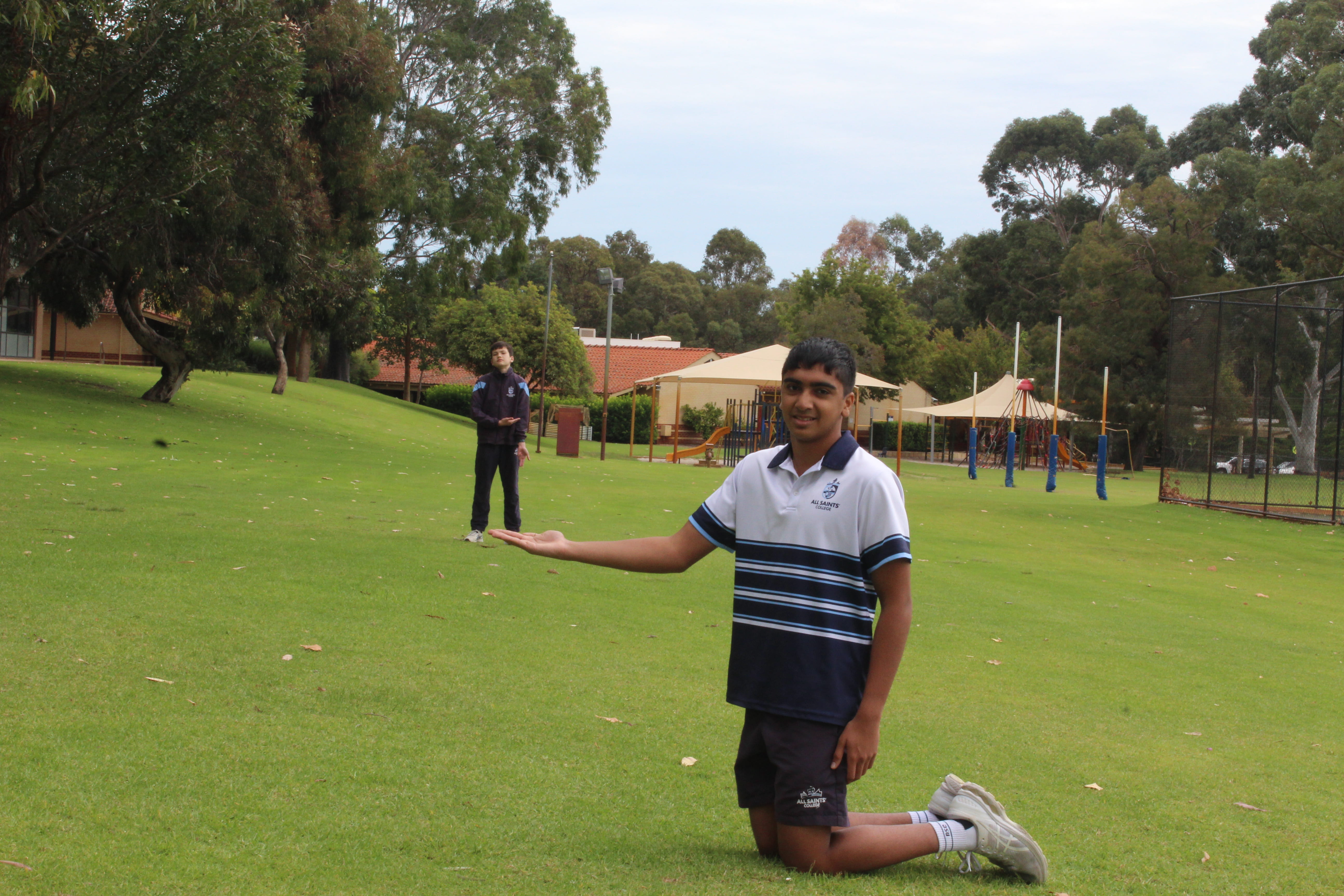
I look way to uncomfortable in this photo and I could’ve placed my hand in a better position. The lighting seems to be alright but the background is bit distracting, and Ben seems a little bit too far/out of focus.
D&T Beyond Selfies
I look way to uncomfortable in this photo and I could’ve placed my hand in a better position. The lighting seems to be alright but the background is bit distracting, and Ben seems a little bit too far/out of focus.
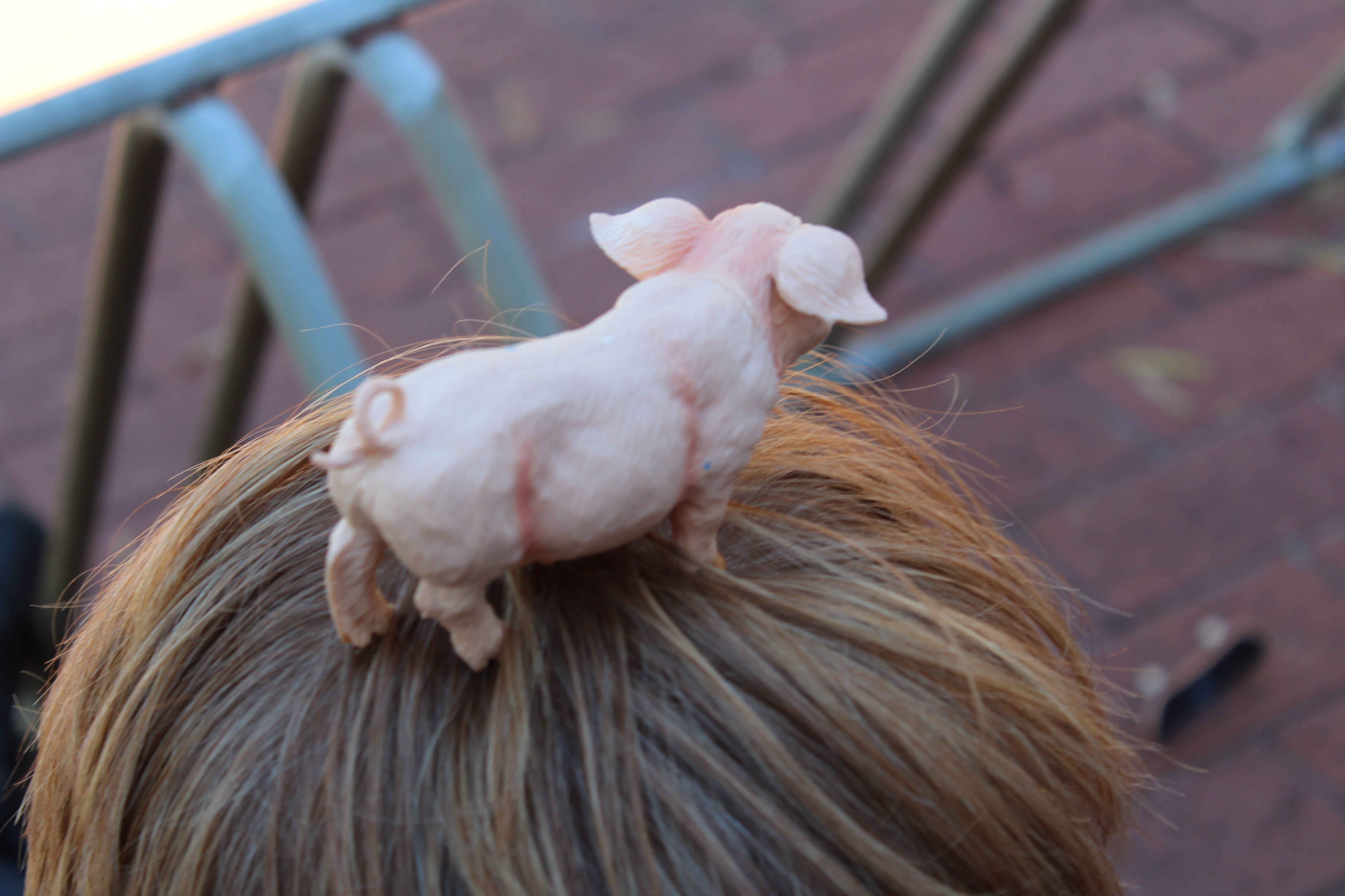
I know I took this photo on Ollie’s head but the top of his head looks like a hay bale. The background was supposed to be an area where there’s less hay on the floor, but I think I should’ve been closer to the grass. The depth of field is good, but could’ve been better. The lines on the pig should be photoshopped off as it would look, aesthetically, better. In conclusion, the photo is alright, but the aesthetics and setting could be adjusted.
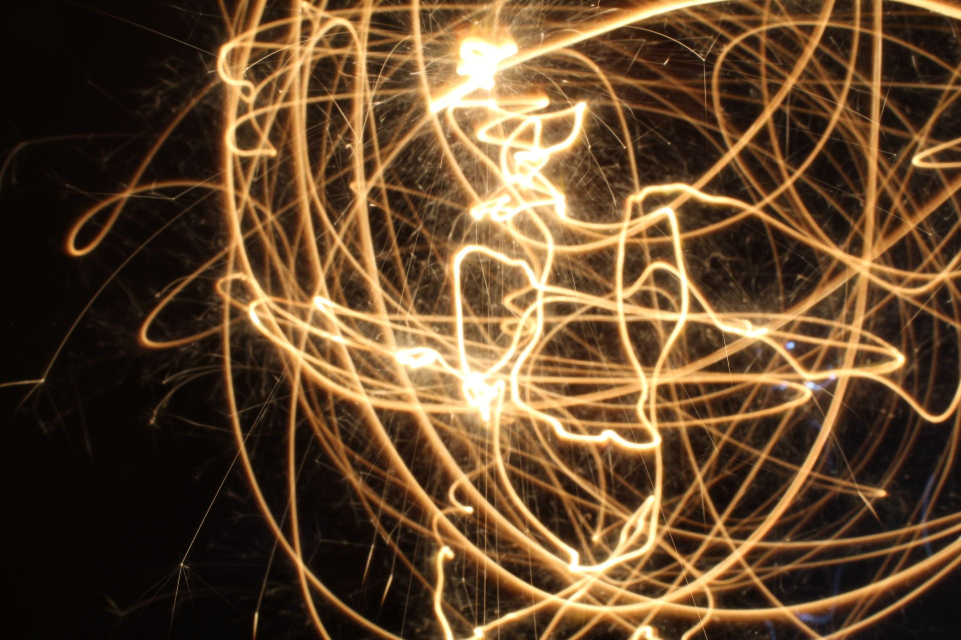
This is an alright photo, we tried to make a pattern but it didn’t really work out. I think there might too much light as the subject in the back isn’t visible at all and looks uneven because it’s out of the frame.
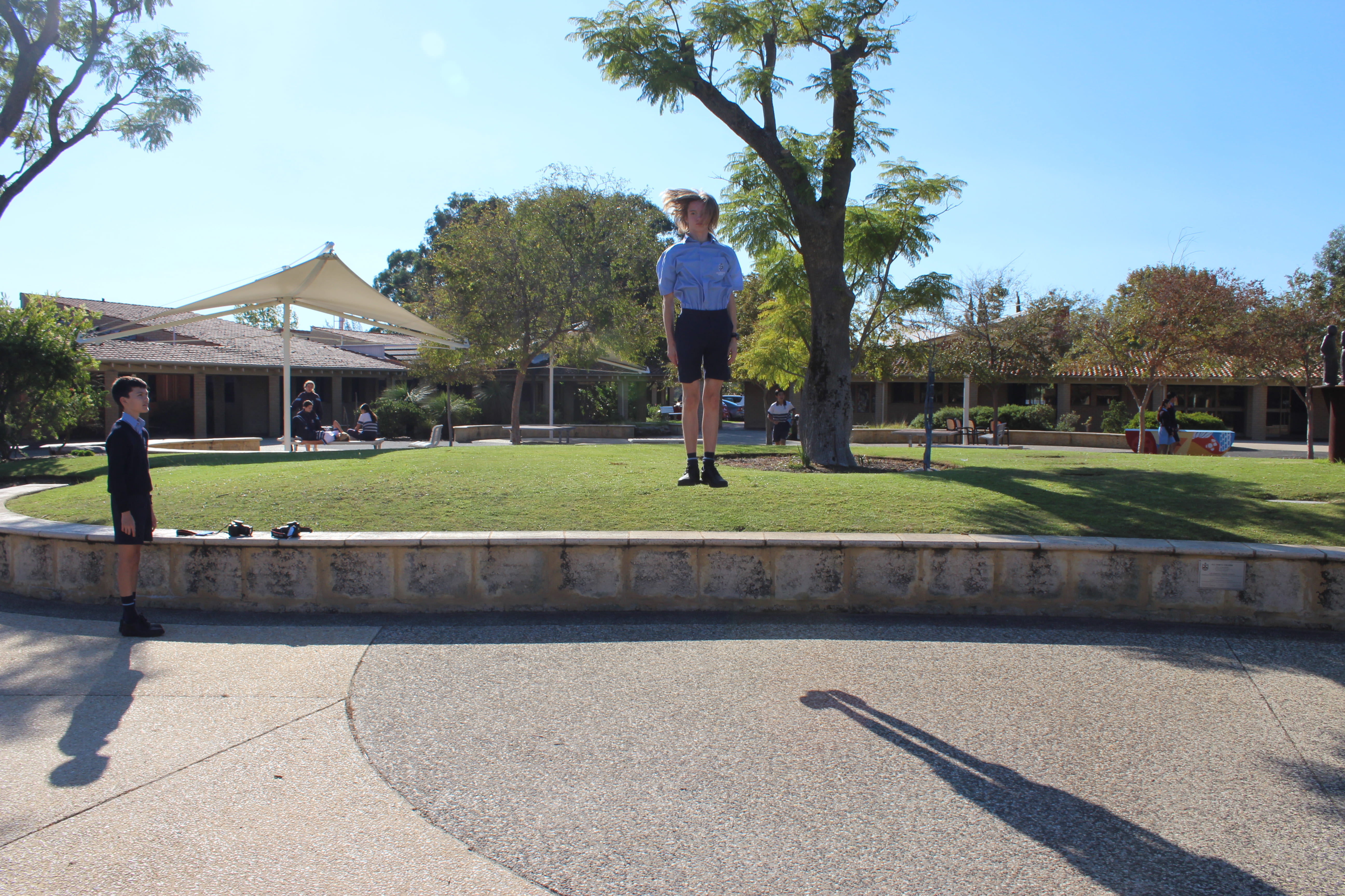
This photo is creative, relative to my other photos, because the height and shot of the frame. The colour puts emphasis on the subject, which is convenient because of our uniforms. The trees and shadows are taking a bit off the subject though.
There is an illusion where it just looks like the subject is standing on the grass. We could take the photo on a different angle to solve this problem.
This photo is great but it could use some improvements to make it better.
I think my photo was pretty good, though it needed some adjustments with the lighting. background and the creativity/theme could’ve been a little different. The angle of the photo is also a bit off. I should’ve used the string to my advantage and made something a little more creative. Like wrapping it around specific objects.
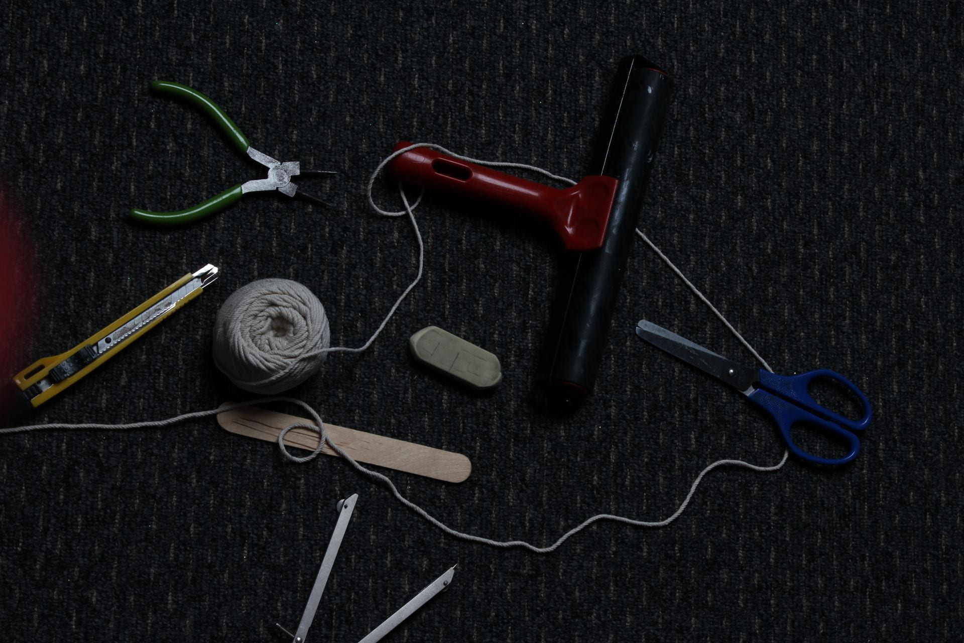
I did like how the items were placed on the floor. Some of the items though feel a little bit out of place, like the green tweezers on the top left corner. Overall, the photo was taken pretty well, though could’ve used some minor improvements
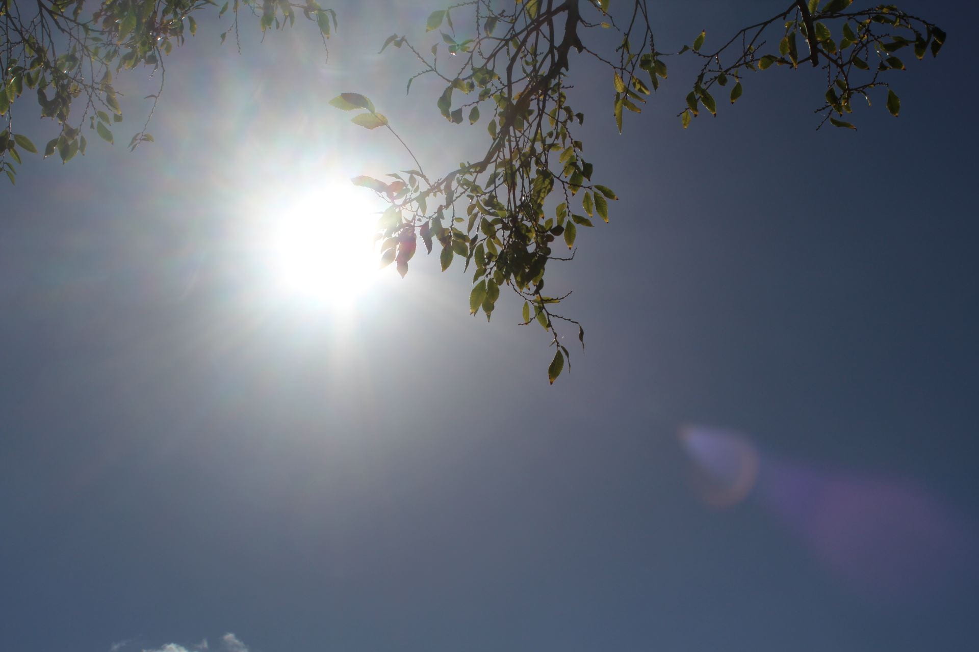
What I like about this photo is that you can take both perspectives of either a bird or a worm. Because of the angle and the view, you can perceive it as a bird in the air looking up or a worm on the floor looking up into the sky. A few improvements could include the shine off the camera lens. This can be fixed by adjusting the angle/position of the camera and possibly how focused or not it is. The trees seem like they are obstructing the wrong side or angle/corner of the frame. I think I’ll let the trees cover the frame little more so then the shine is reduced.
The photo is ok, it could use some minor improvements to increase the overall quality.
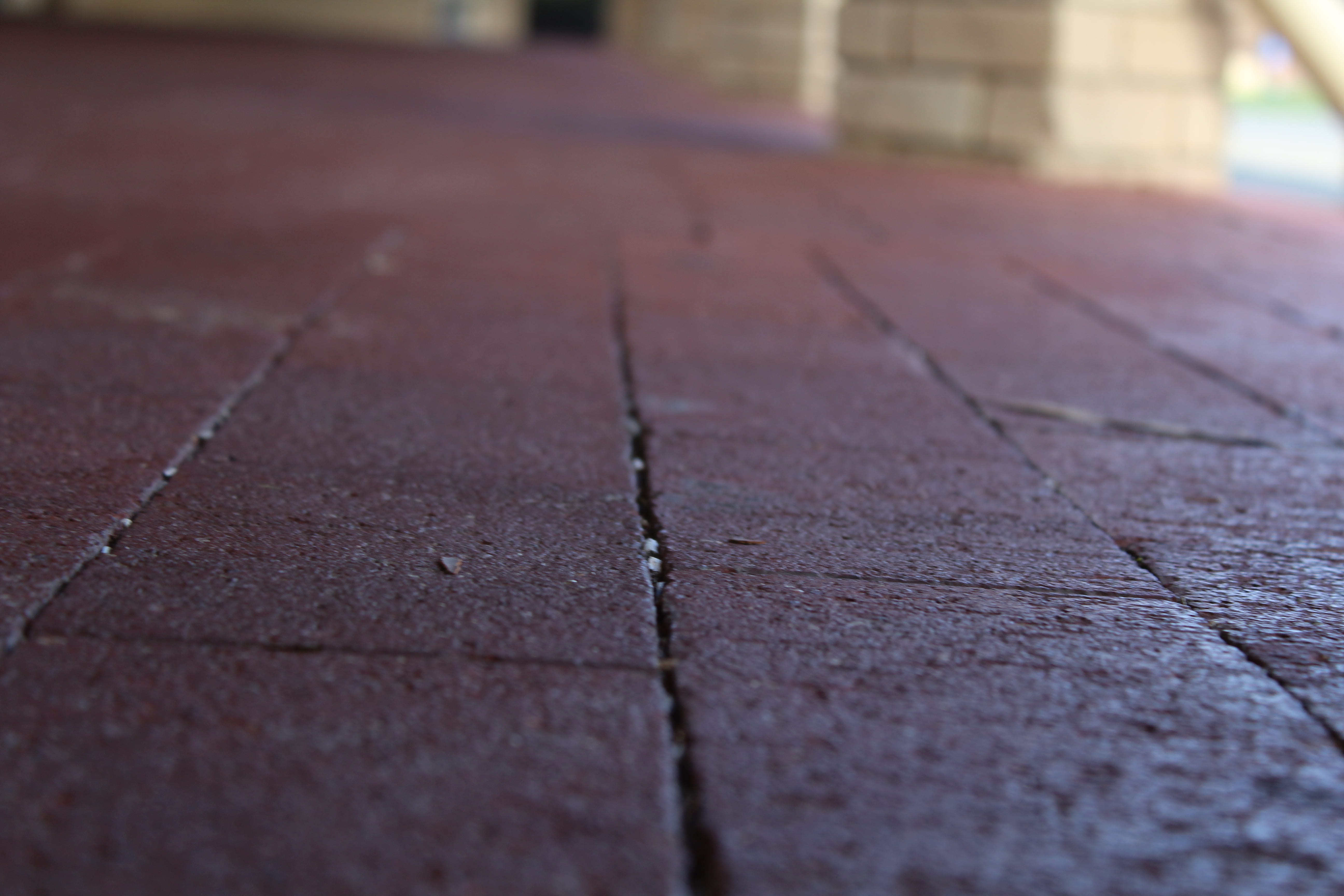
This photo is supposed to be the perception of a worm. I tried to make it unique, and instead of looking up the worm could be out and about and travelling around the campus.
What I like about this photo is that it doesn’t get the whole shot of the frame and leaves the outside blurred out. This represents the size and insignificance of the worm compared to the shot of the bird. I think I could’ve made the photo more creative like using more tools on the camera to get more detail on a specific detail in the shot.
This photo could use a lot more improvement in terms of detail and shots. The setting could’ve been more creative or different.

I think my faceless portrait looks fine, overall, looks fine. I think a few things I could’ve done better like the camera angle, there was a bit of blur in the background, camera placement and the actual environment.
Things I liked:
I likes how the branch covered Zeke’s face, the lighting, the texture of the branch and and leaves.
Things I could improve on:
The blurriness of the background, covering too much of Zeke’s face, the amount of shadows, the camera angle and the film grain from the sky.
For a first time, the faceless portrait is pretty ok. It could use some improvements that are minor, but affect the photo drastically.