In design we were given a project to design a sign for the hangar that would draw people in and create an exciting environment for people to learn and creatively work in. Throughout this design process I learnt many different design elements and principles, how to create a design portfolio, how to use adobe InDesign, and many problem solving and innovation skills.
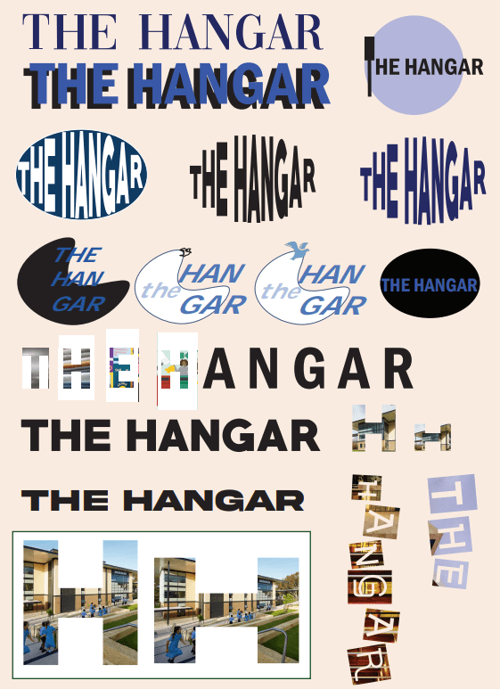
I started experimenting with different shapes, particularly circular shapes, and different ways of presenting the text in
those shapes. I thought that it would be cool to have the words “the hangar” inside a circular shape because circles represent unity and community, but I wanted to be more creative and have the sign be more exciting instead of being too simple. I then tried to make more abstract rounded shapes, and tried to incorporate the school’s aesthetic through the dove symbol. I liked this design, but I still felt like I still had an opportunity to be more creative, and this design limited me in terms of creativity, because I could only really be able to change the colours within the sign.
Closer to my final idea, I tried to fill a block font with different images relating to being innovative- images of different
materials and colourful infographics. I firstly tried to execute this idea by putting the image on top of the the font and then using white rectangles to block out the shape of the letters. After I learnt how to use the clipping mask I started using it to fill the letters up with images of the school. I also experimented with different fonts that were all relatively chunky so that the image would be able to be seen, and ended up picking the font “primetime” (the font on the left in the white box) after peer feedback, as most people liked the look of this font better.
After coming up with a vague idea of what I wanted my design to be- knowing what font I wanted to use and that I wanted to fill it with images I thought I could still improve the concept by being more creative with what images I fill the text with and also by making sure the sign is engaging, represents the college well and is able to create an exciting environment with the ability to stimulate creativity.
Finally, by focusing on trying to display the creativity of All Saints’ College students I came up with the idea of using students artwork as the images that would fill the letters. I tried to curate the artworks so that I could get a range of different mediums and also display art from pre primary all the way up to year 12. I thought this idea would work the best because it met all of the client’s requests and also what I wanted from the design. By using students artworks as a part of the design I was able to make the sign creative, bold, representative of the school, and exciting enough to draw people in and stimulate innovation. This design also provided for added benefits such as an opportunity to display student art, and also more opportunities for art based projects (e.g. a competition for students to have their art featured in the sign).

The final design is two pieces of laser cut clear acrylic per letter, with a piece of paper in between. The paper will be easily replaceable and also double sided, showing two artworks per letter (so if the sign were to be hung up both sides would be seen). The elements of design are mostly fulfilled through the artwork chosen to fill the letters, and because of the easy customization of the photos, can also be adjusted, updated and changed as time goes on.

After coming up with the final design, we were required to pitch our designs to our target audience- the teachers who are part of Propeller Industries, and we also put up a voting system for students who frequent The Hangar to be able to vote.

My reflection:
I think during the design process something I did well was always keeping the design brief in mind and making sure that the design would be suitable and would meet all the targets of the clients and the target audience. If I were to do the design brief again I would probably do more hand lettering and medium experimentation to improve, because I feel like I didn’t experiment with those two aspects enough, and therefore I limited myself with what I could do- if I had done more experimentation I could have thought about also incorporating more creative elements into my final design.
The brief the design had to fit was to be engaging and draw people in, stimulate creativity and innovative thinking, represent All Saints’ in some way and be a form of inspiration to students who frequent the hangar. My final design incorporates the art of many different All Saints’ students and is therefore bright, colourful and representative of the school and the creativity of the students. I believe that this also means that the sign will inspire students and also help them think creatively, therefore achieving the goal of the client and the needs of the audience.
If I had more time to work on this design, I would experiment more with the logistics of the sign and try to find the best way to have the art in between the two clear acrylic pieces- and also research more into outsourcing the production of the sign to somewhere that has a bigger laser cutter. In the future I can also the design I made for other signs, whether within the school, or even as a business outside school, where the new skills I picked up would be useful. I think these skills would also be useful when designing anything using the laser cutter, or even when using
software such as Adobe photoshop, illustrator or InDesign.
Leave a comment