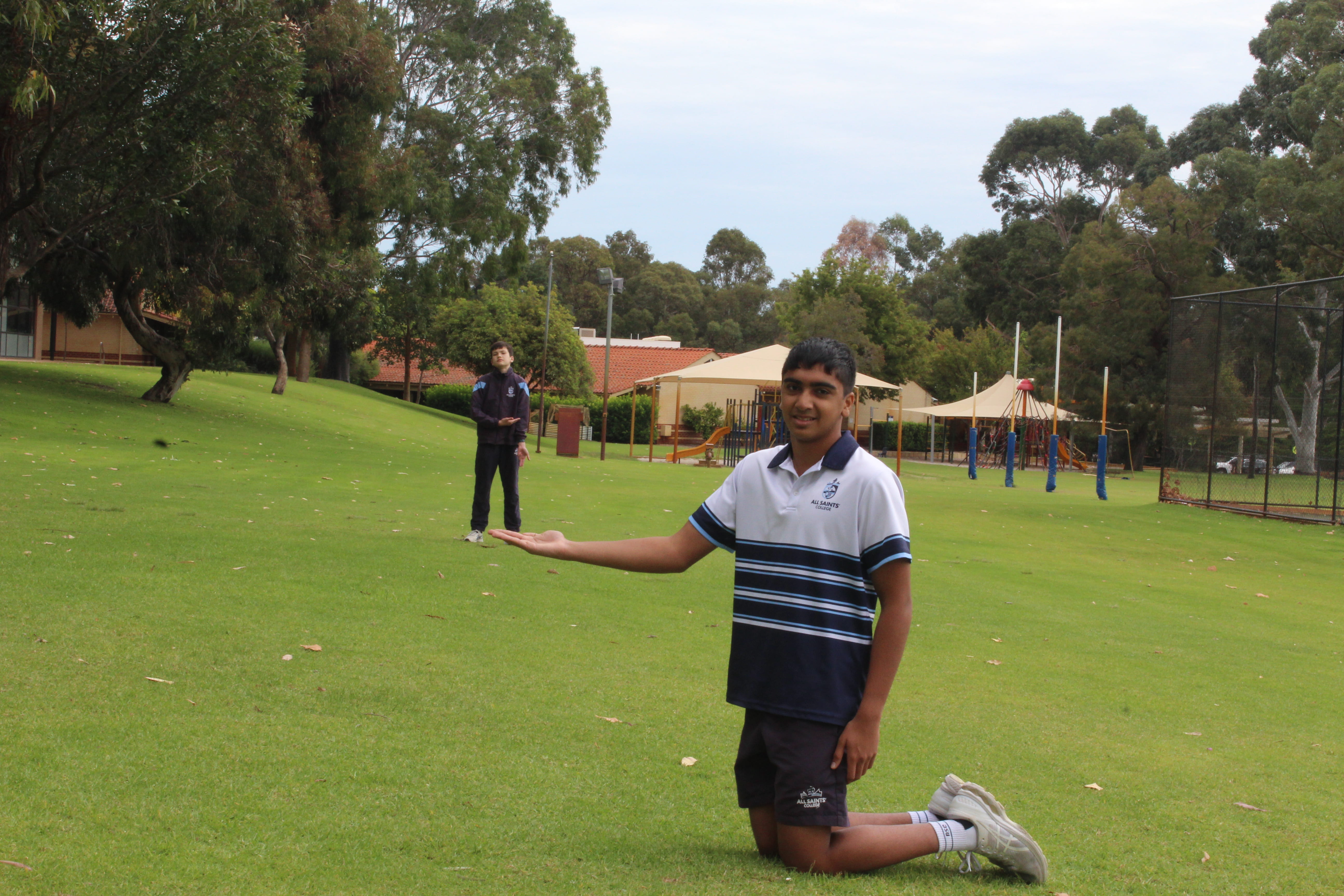
I look way to uncomfortable in this photo and I could’ve placed my hand in a better position. The lighting seems to be alright but the background is bit distracting, and Ben seems a little bit too far/out of focus.
I look way to uncomfortable in this photo and I could’ve placed my hand in a better position. The lighting seems to be alright but the background is bit distracting, and Ben seems a little bit too far/out of focus.
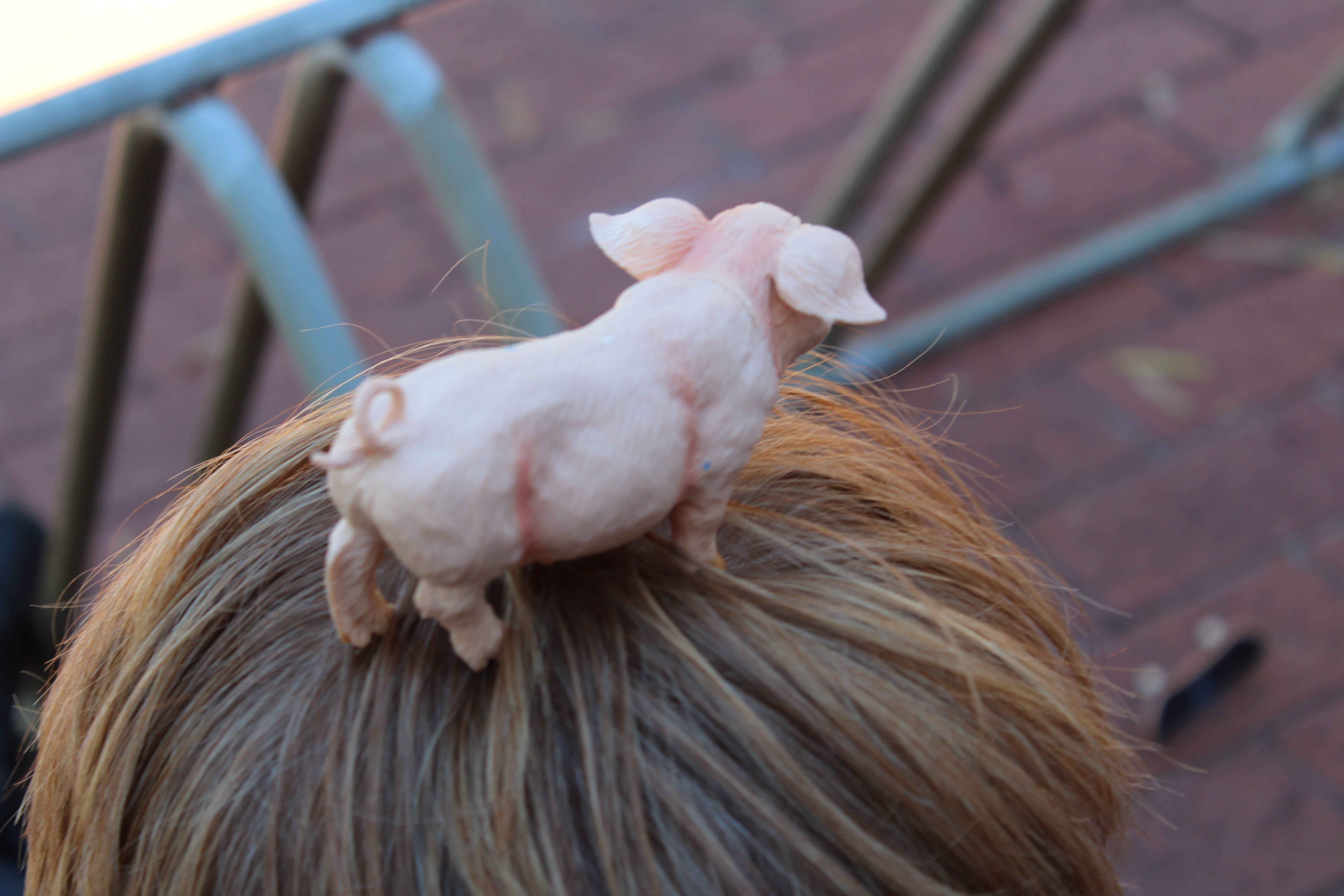
I know I took this photo on Ollie’s head but the top of his head looks like a hay bale. The background was supposed to be an area where there’s less hay on the floor, but I think I should’ve been closer to the grass. The depth of field is good, but could’ve been better. The lines on the pig should be photoshopped off as it would look, aesthetically, better. In conclusion, the photo is alright, but the aesthetics and setting could be adjusted.
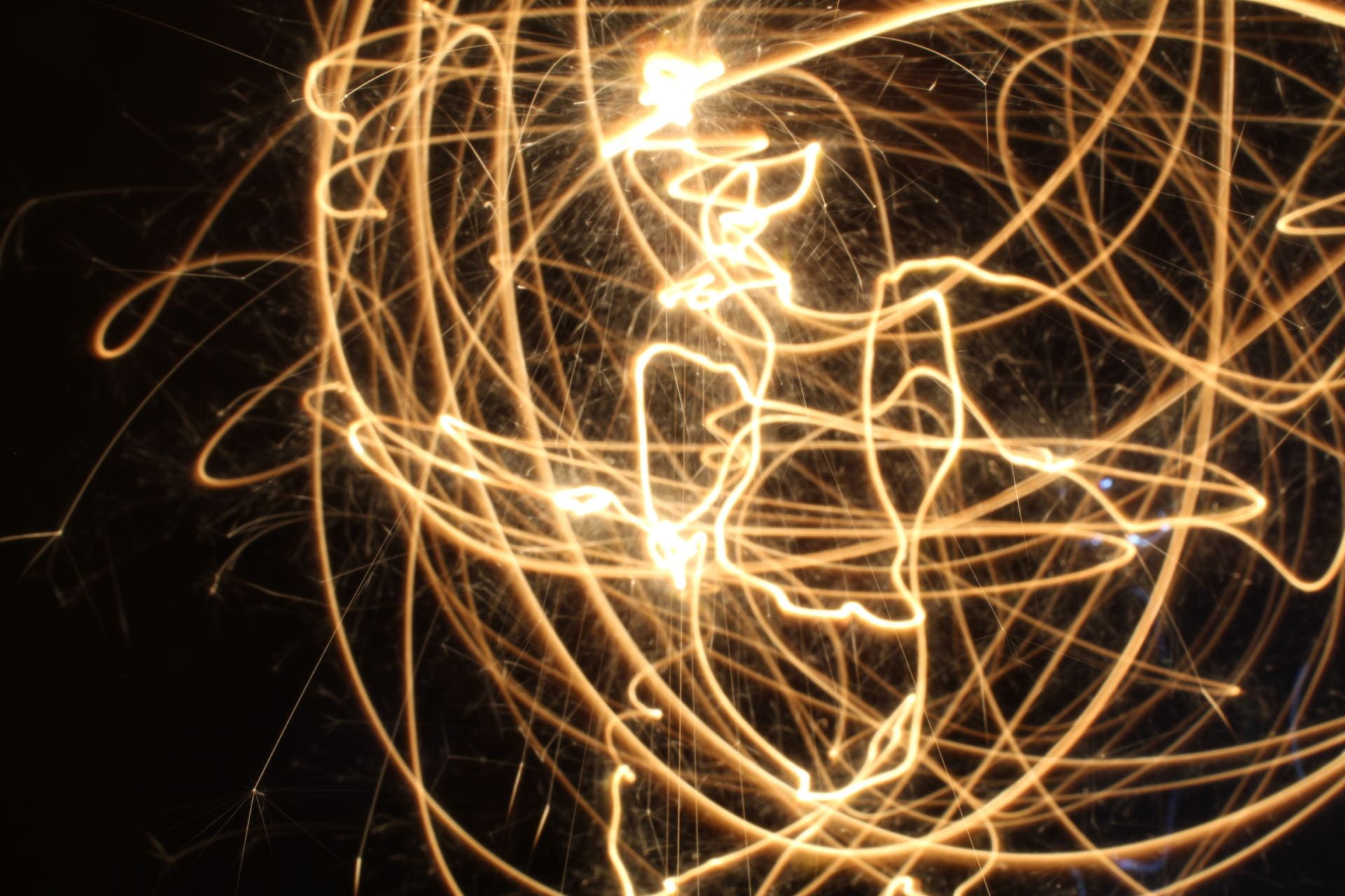
This is an alright photo, we tried to make a pattern but it didn’t really work out. I think there might too much light as the subject in the back isn’t visible at all and looks uneven because it’s out of the frame.
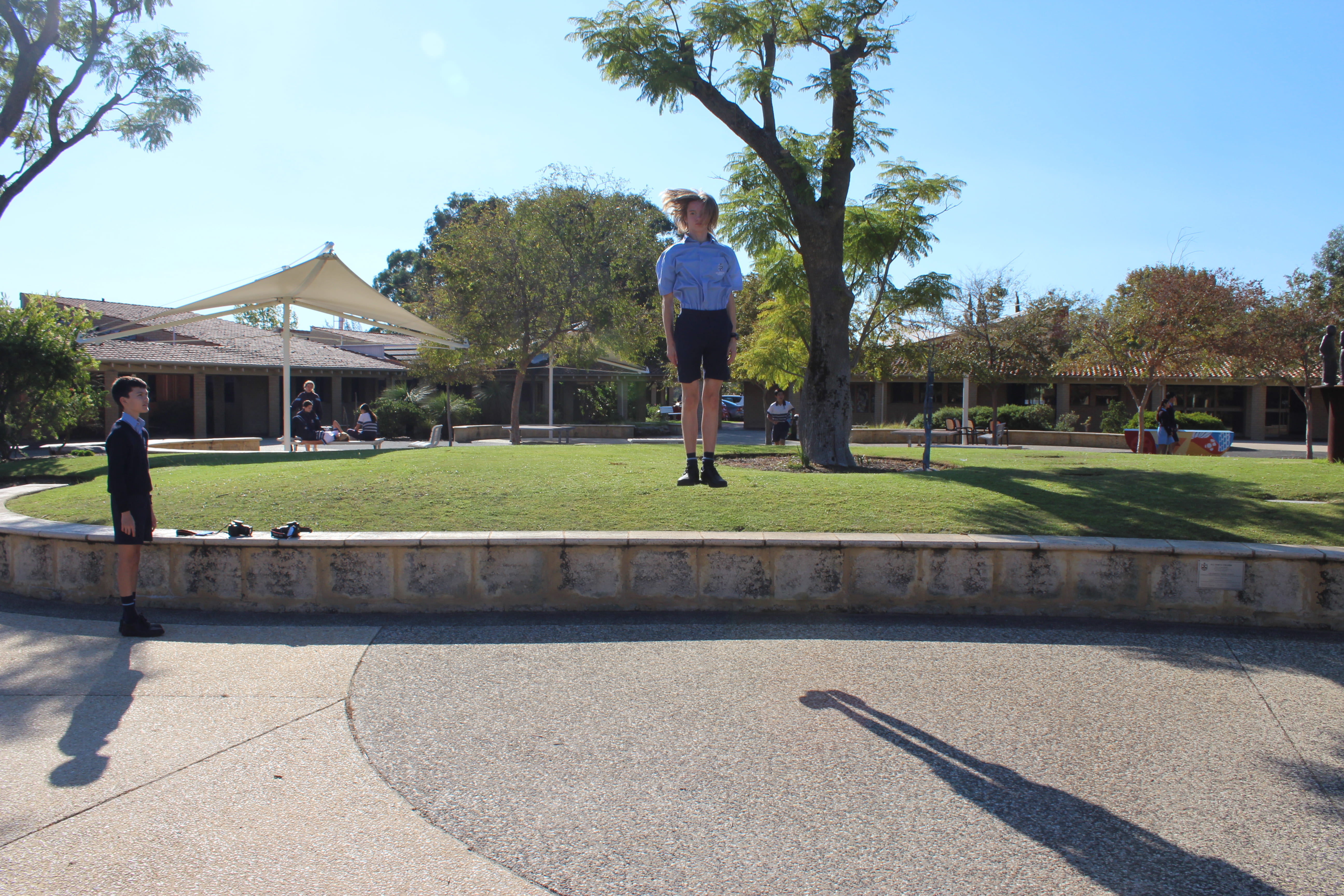
This photo is creative, relative to my other photos, because the height and shot of the frame. The colour puts emphasis on the subject, which is convenient because of our uniforms. The trees and shadows are taking a bit off the subject though.
There is an illusion where it just looks like the subject is standing on the grass. We could take the photo on a different angle to solve this problem.
This photo is great but it could use some improvements to make it better.