We studied what game consoles people prefer to play on as well as how long people usually spend on a screen during the week. Our data has been categorised into different genders. Studying this is interesting as it can show what the majority of a certain group of people like to play and how long they usually spend on a device. The time spent on a device seems more interesting as we can see if people are spending a considerably unhealthy time on a device.
The validation is ok however due to the fact that a console older than i am is on there means some people may have put that down as a joke and the time one could vary depending on what the person does on any given week
The other thing is putting it in a total quiz with 55 questions means that there is a chance that it was towards the end for people meaning some of the answers may not be fully thought through meaning the occasional answer could be discounted however without a way to test which ones were at the end of the quiz makes this a very bad idea as if a fully thought through question is eliminated it means any other not fully thought through answers have a bigger impact
Side thing but why does it count pc as a console in the first question but then separately calls out pc in the second one possibly trying to discourage answering with pc in the first question. This could lead to a reduction in the reliability of the answers due to people interpreting the question differently meaning more people could interpret that pc isnt a console and not vote for it despite it being their favourite putting the pc votes down despite them actually being higher.
The average time people spend on a device is 12.63 hours
The median time people spend on a device is 5 hours, q1 is 1 and q3 is 14
Most people spend between 0 and 1 hour on a device

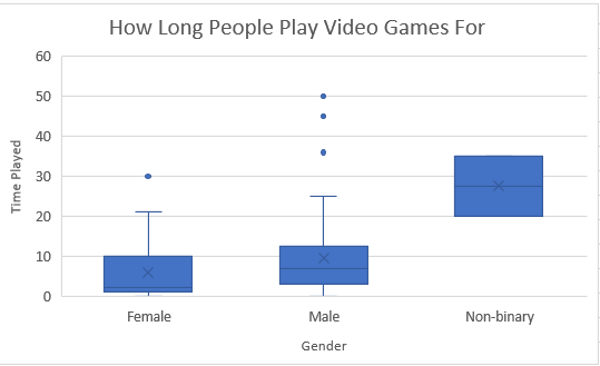

Numerical:
Despite the box plot having outliers as they are mathematically, they arent in practice as its very possible to do them and the numbers arent outrageous. However because its code that put together the graph it still shows them as an outlier, however there were a few we removed because they simply weren’t possible such as one that had the time of almost 4 weeks in one meaning unless the laws of time moved around the person they were a complete outlier. The other graphs we have also removed the choice outliers but kept in the others that were possible as they still contributed, however it skewed the graph positively meaning there is a slight tail behind it, preventing it from being mostly symmetrical however there would have been a positive skew even without the larger numbers. Surprisingly boys on the mean played more video games than girls, this could possibly be because of doing other stuff such as playing sport. It was surprising to find that guys played a lot more videogames than girls.
Categorical:
While guys had a lot more people playing the big consoles girls were surprisingly loyal to both old and new Nintendo consoles with them both being almost 3 times the amount of boys on those consoles. The reason for why however is unknown as the wii came out before I was born, and while the switch has come out a lot more recently it still doesn’t explain why so little boys play on the switch. A possible reason for this is them wanting to play Rosalina and peach, however it could also be smash bros or pokemon. Another piece of surprising data was that so many guys played xbox and pc, that they were each double than the amount of boys playing playstation and almost beat the amount of girls playing wii and switch combined. While other consoles tended to have extremes in a certain console, non binary people only played pc, this could be because there were so little in our year, could also be because they just like pc.
In conclusion. This task was more interesting rather than helpful. It interests me to find that not many people spend loads of time playing games and each game console had a gender majority. This data was impractical as the categorical data was too restrictive in that the wii is an old console and there is a new version it as well as playing on mobile devices not being an option. With the numerical data some people would put very improbable answers that were forced to be put as outliers. The most difficult part of this was most likely putting the information into graphs as a table had to be made which forced us to filter the information then count individually. If this task is to be done again in the future I recommend for the numerical data instead of asking for them to make a number for how much they spend, give them a range, as that data will be much easier to take in. Overall I didn’t find this task very enjoyable as the methods were tedious and the results wouldn’t help in many scenarios.