In 2022 (year 11), I have been coaching the younger year groups in a variety of sports during Interhouse Sport. After participating in the sports myself from years 7-10, I have always wanted to be like the other coaches, and help make the sports fun, engaging and social for the younger years. Some sports I have helped coach this year include year 7 frisbee and year 10 volleyball. I also coached at the year 8 netball lightning carnival in 2021, and at the junior school athletics carnival in 2020. These coaching opportunities allowed me to connect with the younger year groups, gaining experience and knowledge with keeping them engaged, having fun and learning to be a leader. I’ve enjoyed each of these opportunities and learnt a lot about developing my skills in communication, leadership, courage and integrity.
Amana Advocates
In 2021 (year 10), I was part of the service group, Amana Advocates. This group was made up of several students from my year. Amana Advocates was a group designed to visit, socialise and communicate with the residents in the nearby Amana facility. Most of these residents experience impairments and need support in their day-to-day lives. We worked together planning an activity that would involve the year 7 and 8 students, and spread awareness on the lives Amana residents live in an engaging way. However, due to the COVID-19 restrictions, we were unable to follow through with this activity.
Forced perspective
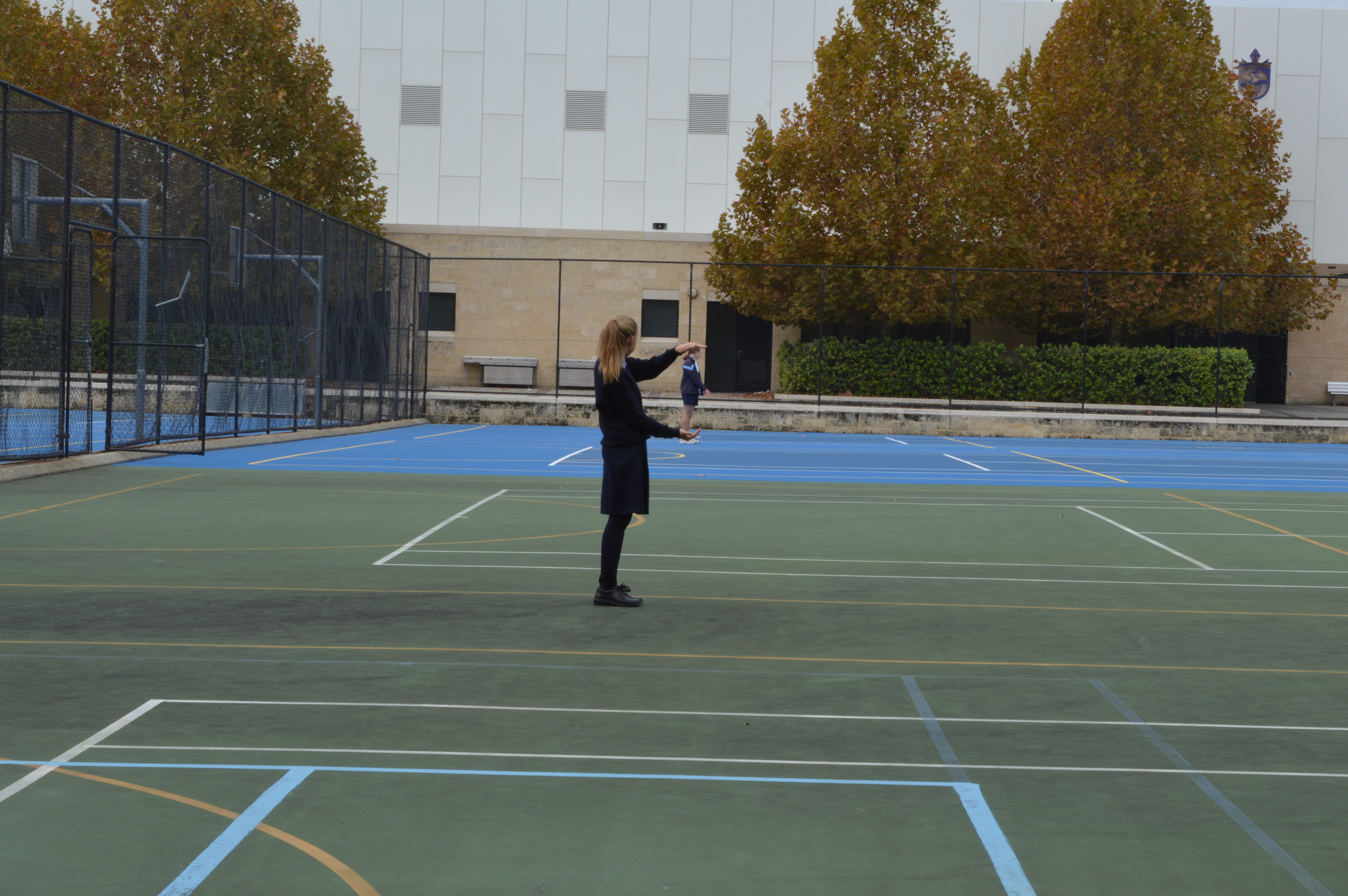
In the forced perspective images we set a large depth of field and attempted to make creative images using how close everyone was standing to the camera.
WWW: I do like how since I am standing further back it looks like keira is holding me in her hands. I think it makes the image somewhat creative.
Improvements: I think the image could’ve been more creative if there were costumes and it was photographed in a more aesthetic place. The background is distracting since it has different colours, lines, trees and buildings, which all takes away from the focus and clutters it. The lighting also could have been improved if we changed the ISO since it is quite a dark/gloomy image/lighting. Leading lines and more rule of thirds would’ve made this image a lot more appealing and overall better and would’ve created a more centred focus on us.
Toy photography
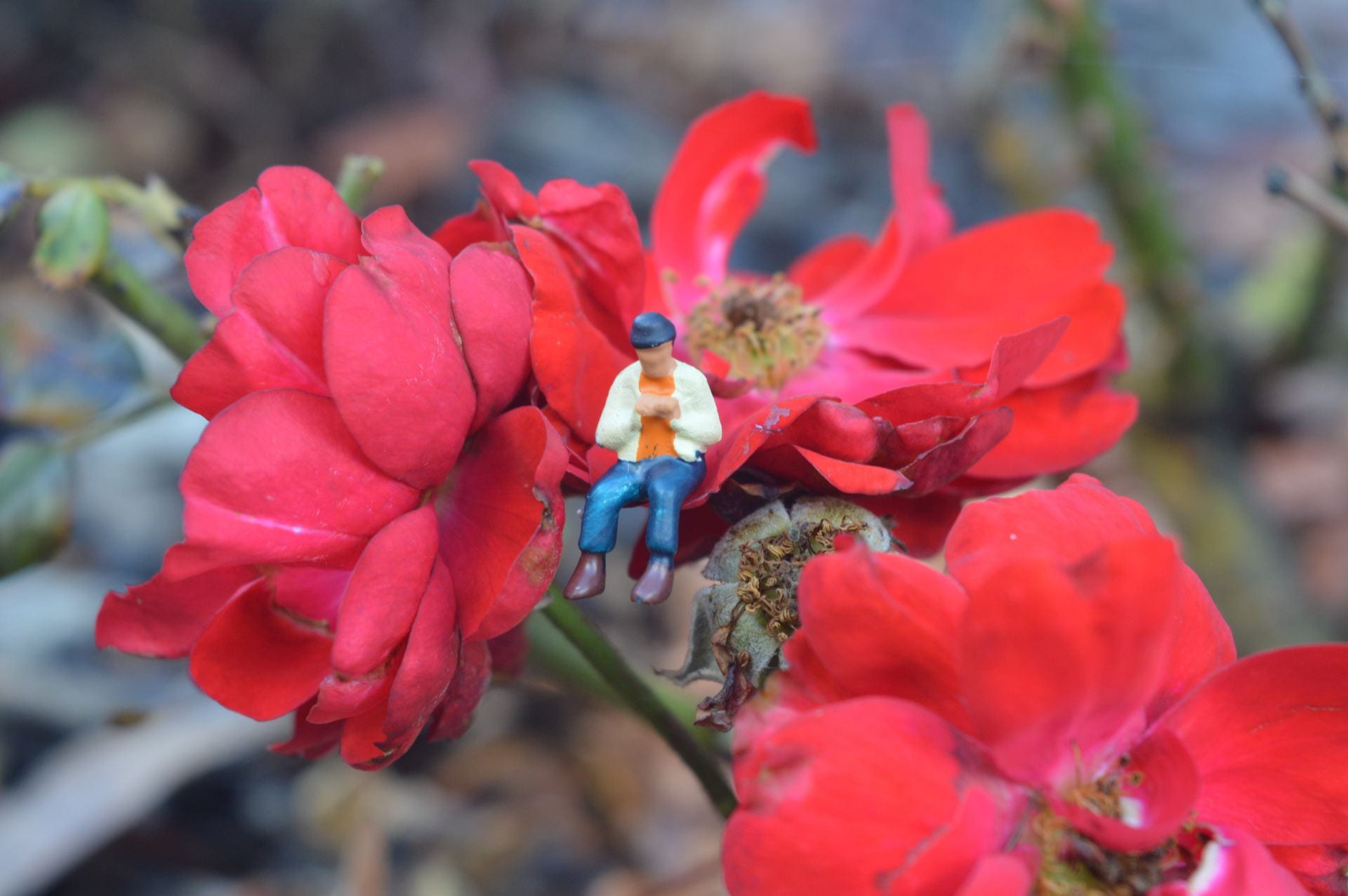
WWW: I think the image is relatively creative with the guy sitting on the flower. I like the colour contrasts of the flower and the person. It has a small depth of field which I think makes the image more appealing and emphasizes the focus on the small character.
Improvements: I think the flower is a bit brown and dying in places which can be seen as taking away from the image aesthetic or can be seen as adding to a storyline of the image. Leading lines would’ve made the image look more appealing and drawn the viewers eyes to the centre person too. The background of the image is a bit busy and distracts from the focus of the person and flower.
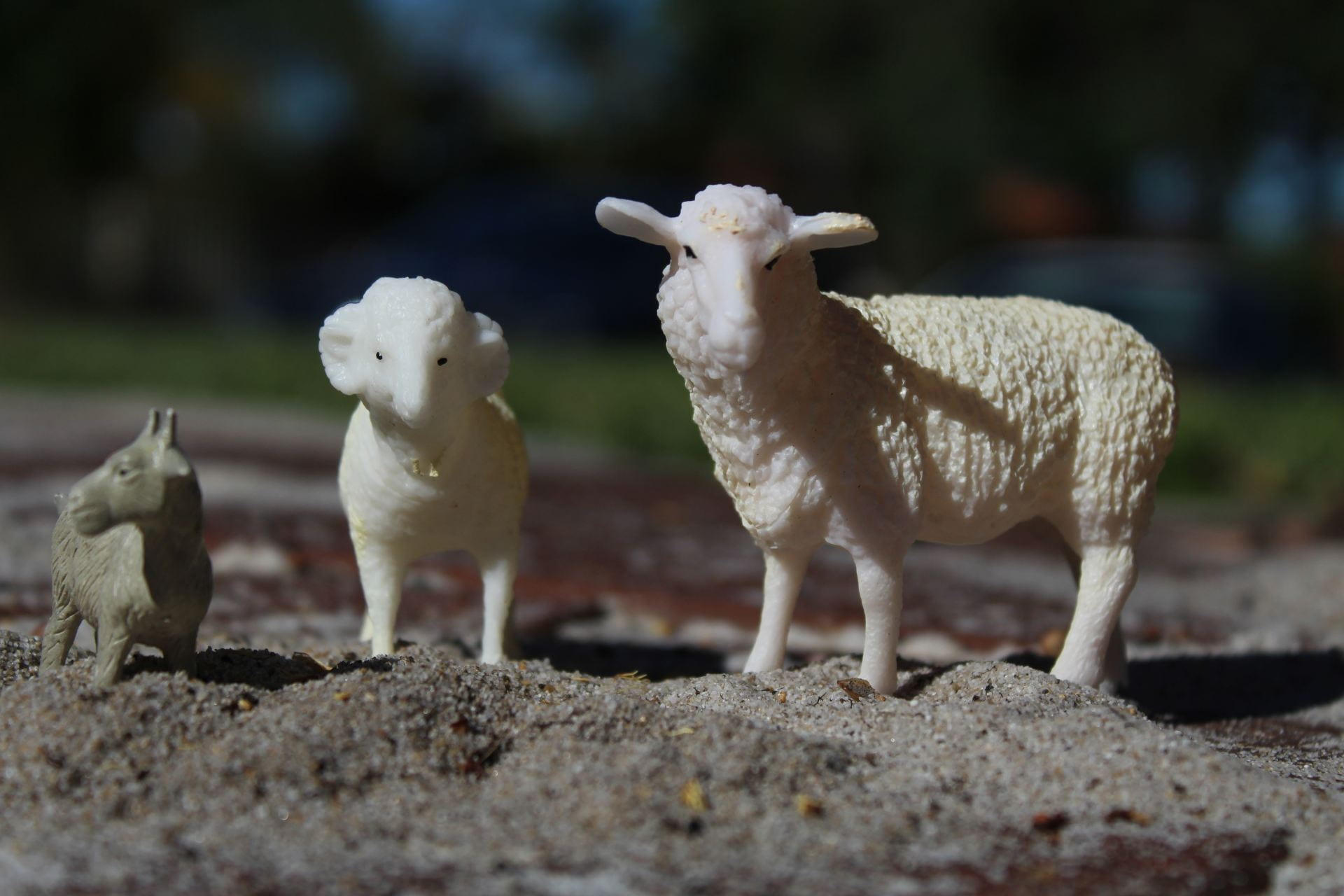
The toy photography photos I got definitely are not great but they have some okay things about them.
WWW:
I like the height progression of the animals in the image and them facing different ways kind of makes a rule of third. I also like the different elevation of the sand pile which I guess in a way makes it look like a natural habitat.
Improvements:
Everything else in the image was not great. There wasn’t any leading lines in the image which would’ve made it more interesting and would’ve drawn people’s eyes to the image. There are shadows on the sheep from poor lighting which took away from the aesthetic aspect. There also could’ve been a creative backstory but this photo doesn’t have one. I feel like it also needs some sort of additional colour to make the image look more aesthetic.
Light graffiti
In the light graffiti images we had to use adjusted shutter speeds and lights in the dark to create patterns or image effects.
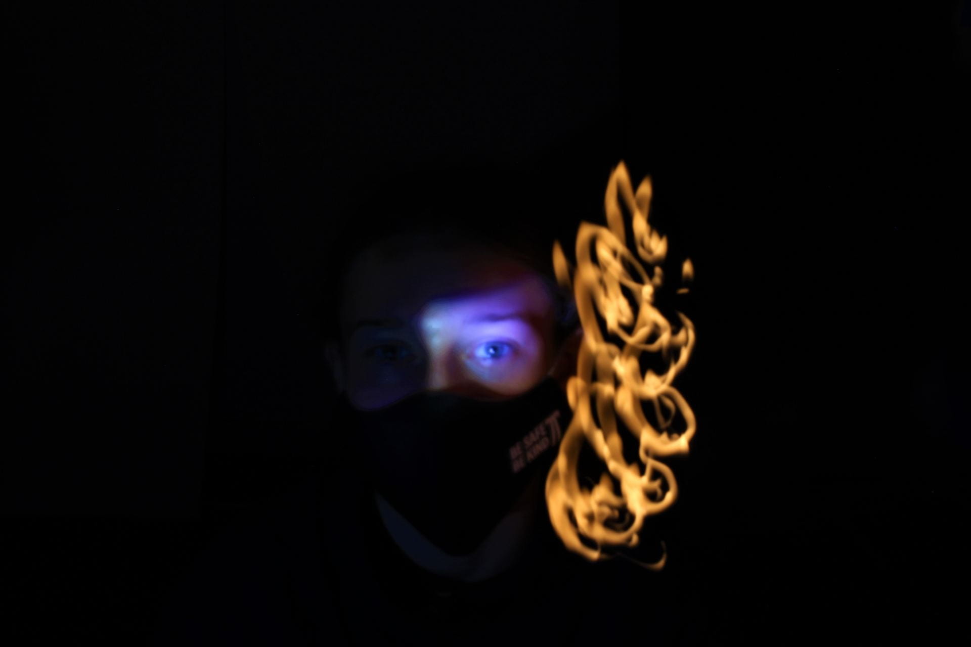
What went well:
I like how the dark background and coloured light pattern next to my face makes my eye become lit up and a focus in the image. The light colour of my eye compared to the light pattern also works well since they are different yet kind of compliment each other. The pattern of the light by my face is made to look like flames or fire and follows my face shape, which I think adds to the images creativity and effect.
What could’ve been improved:
My eye could have been in a bit more focus since it is a bit blurred which takes away from the quality and focus. My mask also has writing on the side of my face that has been focused and lit up, which is slightly distracting but overall not too noticeable. The image’s creativity could’ve been improved with maybe a different pattern around the face, but I think it is still decent in creativity.
Levitation photos
In the levitation photos we had to try take images where we look like we were doing regular activities, but while in the air/jumping to make it look as if we were “levitating”
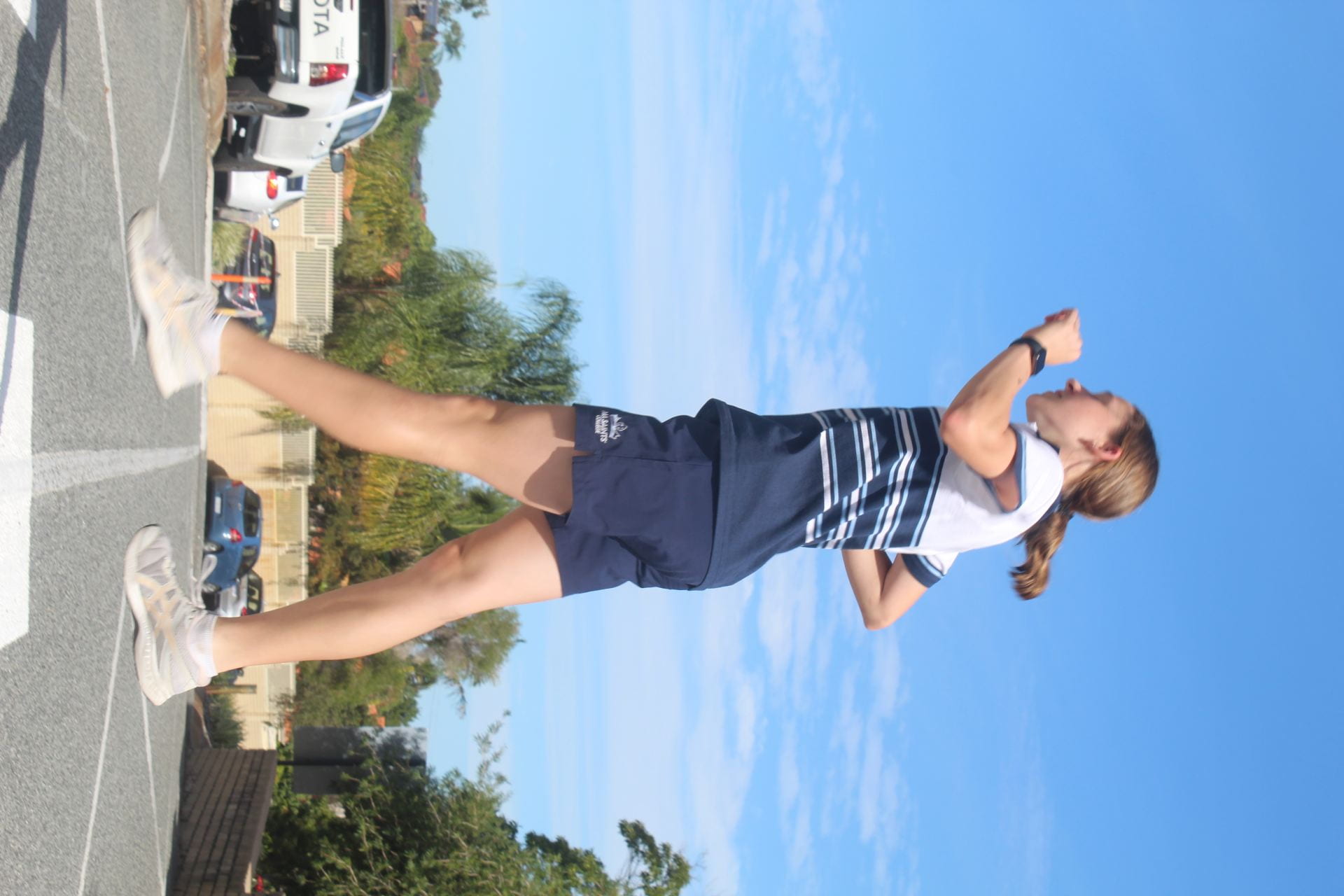
What went well:
The image has good lighting and leading lines, with the line following through the middle of the pedestrian crossing and the middle of my legs, which draws your eyes to the focus person and splits the image in a way. I think I look relatively levitated but that could be improved on.
What could be improved:
The background of the image (mainly the cars and fence) is a bit busy and distracting, taking away from the main focus and adding colours into the mix that don’t really match. My feet are a bit blurred and I look a bit stiff which makes it look unnatural and not really levitating. It is sort of creative but would have been better if we had a costume or if we photographed on a cloudy day, I could’ve been crossing with an umbrella (a certain colour to add to the image), a newspaper and a raincoat.
Capturing kindness

My capturing kindness photos explores the concept in a slightly less generic way. Instead of picturing an elderly and young person doing some sort of activity together, I decided to show the kindness in a different way. This image shows kindness from people towards nature.
what worked:
I like how the flower is the center focus and how the hand is holding and caring for it. The flower’s colour stands out but also works with the background colours of dark green and browns. I think the image is overall reasonably creative since it isn’t the usual elderly and young, but it could’ve been improved. The fact that the flower is pictured being held next to the dead flowers can be interpreted as people protecting the earth as it is vulnerable and dying.
what could be improved:
I think there is quite a lot that can be improved. The flower would’ve been more aesthetic to look at and would’ve stood out more if there weren’t dead flowers beside it. It also isn’t very centered. You can see the shoes and uniform of the person holding the flower, which draws attention away from the main focus. It also would’ve been more aesthetic if there was a more neutral background (the person and ranges of colour takes away from the piece) and the flower stem was in the middle, not pointing to one side.
FLAT LAY
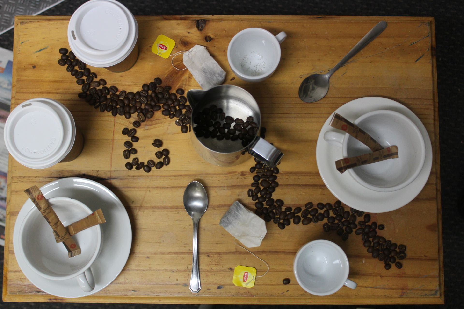
Lay out: The lay out of the image is okay. There is somewhat of a leading line/line of division that helps separate and create balance in the photo.
What I like: I like the theme and colours in the image. I also like the symmetry of the photo, with the same coffee cups, spoons e.c.t in the image.
Creative: It is quite creative because of the coffee beans design in the leading line. Creativity could’ve been improved by more colourful tea bags that don’t blend into the background as much. Glitter could also have been added to make the image more captivating.
Balance: The division line of the coffee beans creates a nice balance and symmetry in the image. The equal and identical coffee cups, spoons and tea bags e.c.t make the photo a bit pleasing to look at.
Colouring: I like the theme of the colouring with the shades of brown, whites and spots of silver. The colouring could be improved if I maybe took a risk with it and added some pops of colouring in things like the tea bags.
Overall improvements: Overall, the colouring, lighting and creativity could be improved to make the image more captivating and aesthetic.
Birds and Worms Eye View
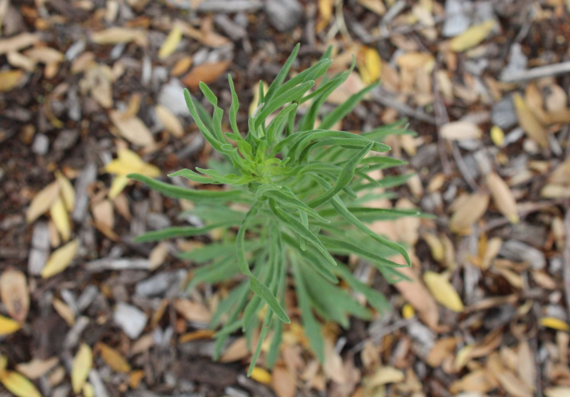
Reflection of bird’s eye view image:
I like that the plant is in focus and the background is blurry. I think it makes the plant stand out. I also like the colours – the brighter green on the plant has a nice contrast with the more autumnal colours on the ground. I think this adds to the image’s overall aesthetic.
Despite that, I think that there are still quite a few improvements that could be added to the photo.
Creativity: The first improvement is with my creativity. This could be added if there were raindrops on the plant, a less distracting background and by having a more colourful plant as the main focus.
Aesthetic: The image’s aesthetic is decent but could be a lot better. There isn’t really a leading line in the photo, but I think it would add sharpness and framing. However, the plant’s “arms” act as semi-leading lines. There is a bit of rule of thirds in the image, with the plant more in the middle third (length-wise) and then the background in the remaining thirds. The background however does distract from the focal point a bit, as it has distracting colours of yellow and browns which takes away from the bright green of the plant.
Skills: My skills in photography still are not very developed since I am very new to it. The bottom of the plant is a bit blurry, but I wanted the background to be completely blurred because it highlights the plant and makes it stand out.
The high angle usually asserts dominance and shows what is imaged as being ‘less than’, small, fragile and weak. In this instance, the plant can be viewed as under attack from something – for example humans/climate change against the environment. It causes us to deem the plant as fragile and vulnerable to the bigger source.
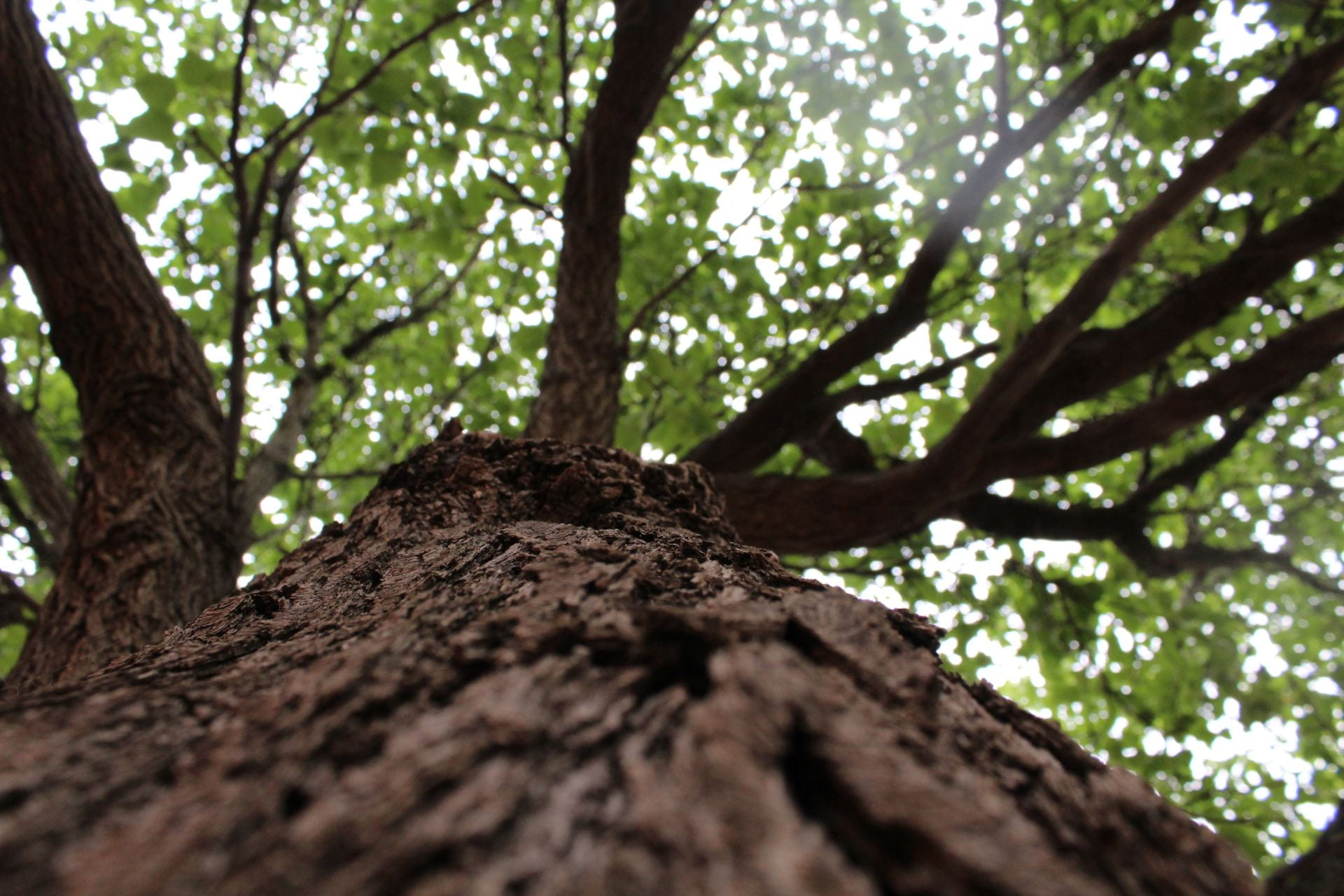
Reflection on worm’s eye view image:
I like that you can see the texture of the tree bark close up in the image, as well as the colours of the brown trunk and green leaves in the background, because I feel as though it adds to the overall aesthetic. The tree trunk is sort of a leading line in the image but not a very obvious one.
Improvements-
Creativity: The photo isn’t very creative. I think that having a less over exposed background and rain drops/rain could make the image much more creative and appealing.
Aesthetics: The tree trunk acts as a semi-leading line but would be better if it was in the middle of the image and had a direct focus to the top of the tree and leaves. I could’ve improved the rule of thirds by having the trunk in the middle and bottom third of the photo, and then the branches acting as leading lines out of the third and into the remaining space.
Skills: The background behind the leaves is a bit over exposed which takes away from the leaves’ colour and aesthetic. The bottom of the tree trunk is also slightly too blurry since I was trying to make it the focused part of the image, with the rest of the tree blurry.
The low angle frames the tree as being more dominant, stronger and powerful. In this instance, it could be related to the real world as the tree is a strong built structure that provides the earth with many benefits, therefore conveying the idea that it is important.
Faceless Portrait
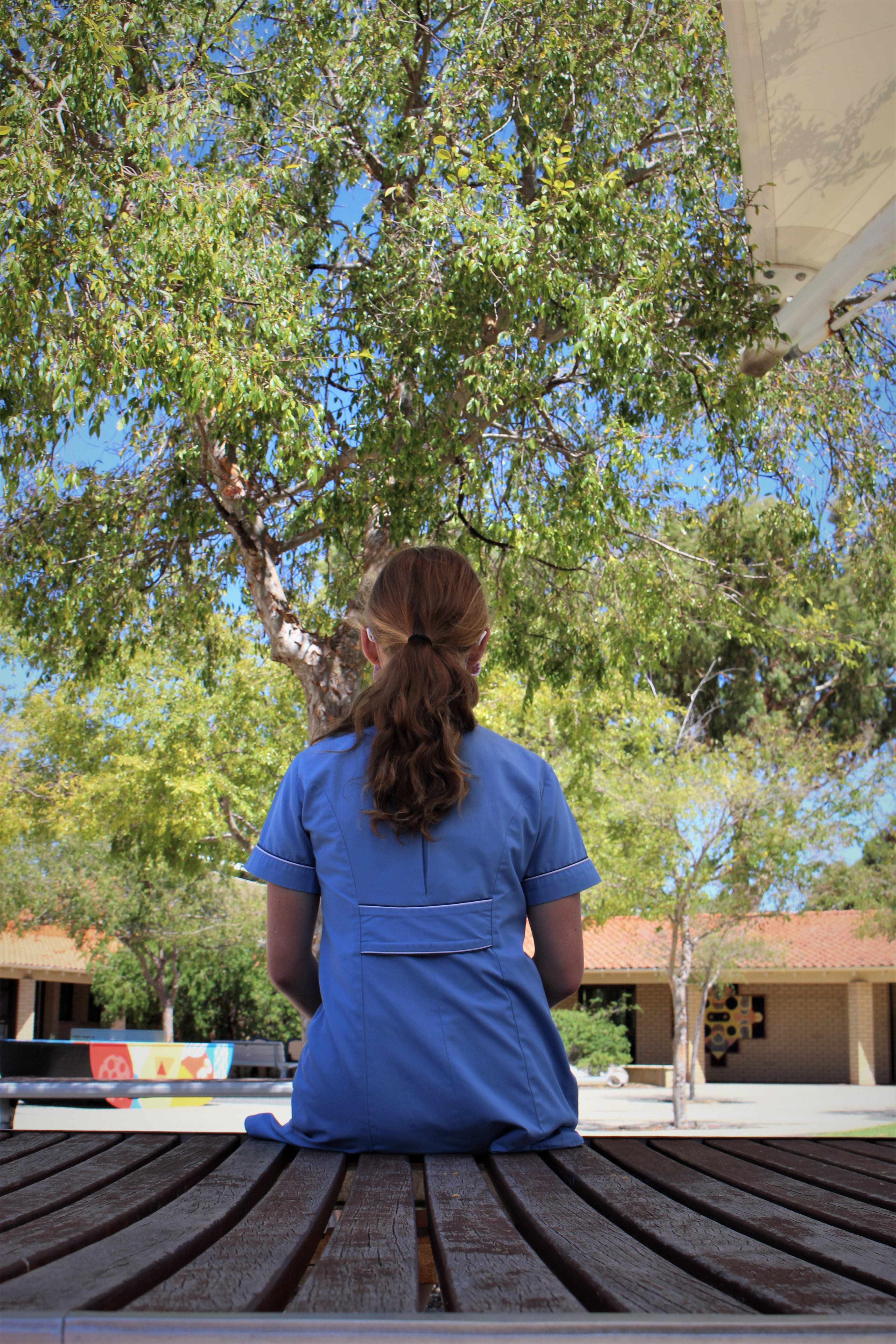
Reflection:
I like the overall idea of the photo and attempts of using some visual techniques. I tried using leading lines from the bench to draw your eyes to the person. I also tried to use perspective with the bench by lowering the camera to its level. Rule of thirds was also attempted by putting the bench in the bottom third of the image.
Improvements:
The composition – The colourful patterned ping pong table closer to the bottom left of the image adds too much contrast to the rest of the colour scheme. In the top right hand corner there is a shade cover that adds a distraction and takes away from the main focus. There is also a tile pattern wall on the building which adds to the distraction.
The camera angle could’ve been lowered so you could see more of the bottom of the bench and create more of an obvious angle and perspective.
The creativity in the image was decent but definitely could’ve been improved by adding possibly costumes or props.
My skills aren’t great since I am new to photography, but to improve them, I could’ve focused more on the angle of the camera, and focus (for example, whether the whole image is clear and focused, or if I have the main person and leading lines in focus, and then background blurred)
Finally, the image aesthetic could be improved by having the main person wearing a colour that creates a contrast to the background and leading lines colours, but isn’t so different where it is overly distracting. Other than that, the shades of brown on the bench and greens on the trees does mix quite well.