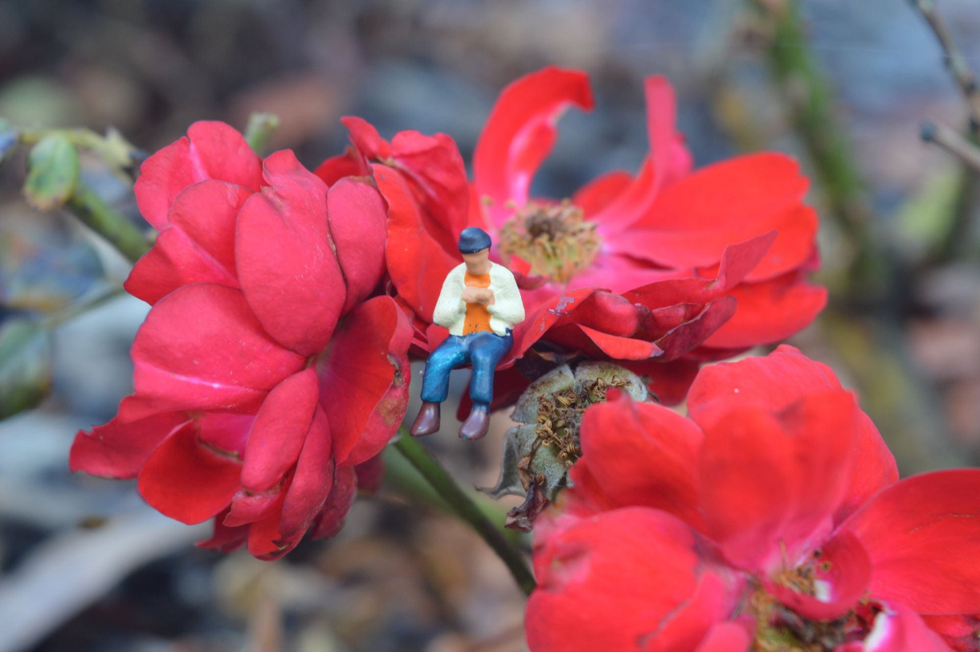
WWW: I think the image is relatively creative with the guy sitting on the flower. I like the colour contrasts of the flower and the person. It has a small depth of field which I think makes the image more appealing and emphasizes the focus on the small character.
Improvements: I think the flower is a bit brown and dying in places which can be seen as taking away from the image aesthetic or can be seen as adding to a storyline of the image. Leading lines would’ve made the image look more appealing and drawn the viewers eyes to the centre person too. The background of the image is a bit busy and distracts from the focus of the person and flower.
The toy photography photos I got definitely are not great but they have some okay things about them.
WWW:
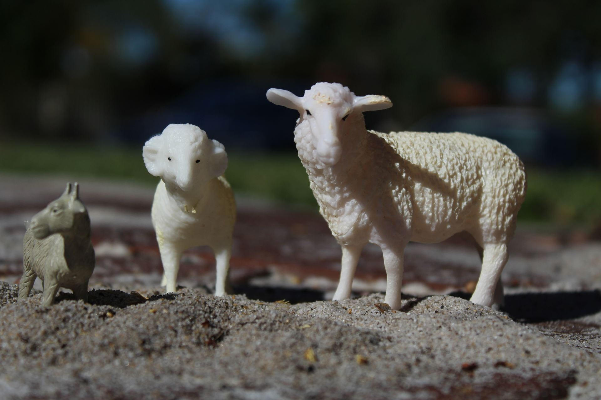
I like the height progression of the animals in the image and them facing different ways kind of makes a rule of third. I also like the different elevation of the sand pile which I guess in a way makes it look like a natural habitat.
Improvements:
Everything else in the image was not great. There wasn’t any leading lines in the image which would’ve made it more interesting and would’ve drawn people’s eyes to the image. There are shadows on the sheep from poor lighting which took away from the aesthetic aspect. There also could’ve been a creative backstory but this photo doesn’t have one. I feel like it also needs some sort of additional colour to make the image look more aesthetic.