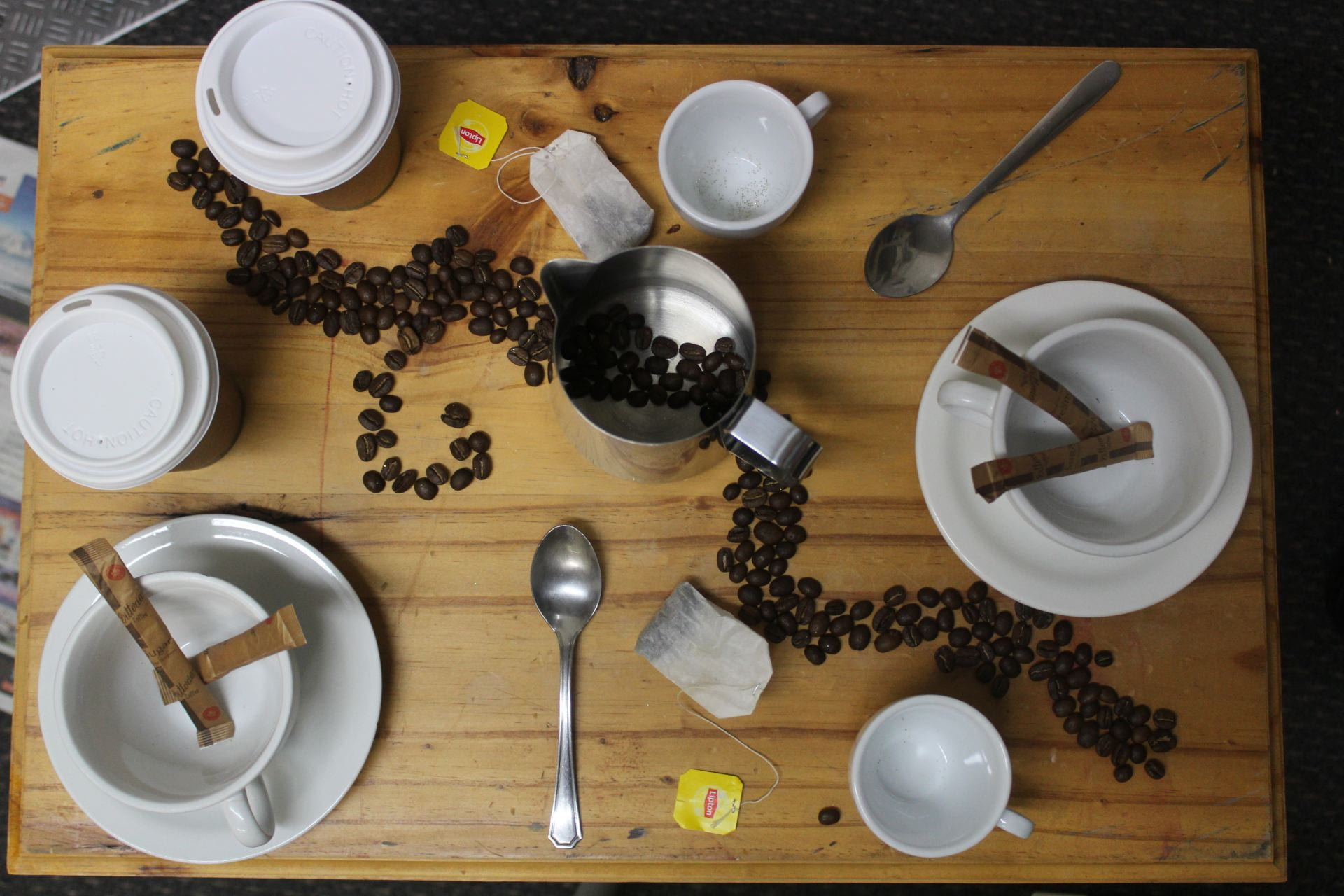
Lay out: The lay out of the image is okay. There is somewhat of a leading line/line of division that helps separate and create balance in the photo.
What I like: I like the theme and colours in the image. I also like the symmetry of the photo, with the same coffee cups, spoons e.c.t in the image.
Creative: It is quite creative because of the coffee beans design in the leading line. Creativity could’ve been improved by more colourful tea bags that don’t blend into the background as much. Glitter could also have been added to make the image more captivating.
Balance: The division line of the coffee beans creates a nice balance and symmetry in the image. The equal and identical coffee cups, spoons and tea bags e.c.t make the photo a bit pleasing to look at.
Colouring: I like the theme of the colouring with the shades of brown, whites and spots of silver. The colouring could be improved if I maybe took a risk with it and added some pops of colouring in things like the tea bags.
Overall improvements: Overall, the colouring, lighting and creativity could be improved to make the image more captivating and aesthetic.
love to coffee beans line
lovely style of photos and how this in the line of division, lovely work luv : )