Introduce your research, including what you are studying and provide a rationale for studying it.
We are researching whether or not students, this year were happy with their electives given to them or not, as well as how many people they would prefer in their typical classroom. Both of these topics are important due to the fact that, if the students do not get given electives that they are interested in or passionate about it will most likely lead them to securing a bad future for themselves such as not being able to get a good job. Whereas the second numerical questioning is slightly less relevant although it does show the students perspective on whether they like higher or lower amounts of students in their class.
Comment on the validity and reliability of the research methods used in this project.
Biases may be found for the numerical question: In your opinion, what would be the ideal class size for Maths, English, Science or Humanities? This may be due to the fact that other people may be more “talkative” or communicative than others meaning that the more talkative people would quite obviously choose to have a higher amount of people in their class. As well as this the demographic data may affect the categorical questions depending on their response for what pathway they are headed towards in the future. If they were headed towards the Vocational Education and Training, and then proceeding to go to do ATAR rather than simply doing ATAR, it would be likelier that the people would care less or be happier about what electives they receive.
Numerical Data & Graphs
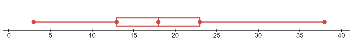
This graph shows the numerical data presented in the form of a box and whisker plot. The data used in this graph is mentioned below, containing the minimum data, lower quartile, median, upper quartile, and the maximum data. The box and whisker plot shows the Minimum value, lower quartile, median, upper quartile, and maximum value of the data collected from the survey. The frequency shows the recurrence of the preferred class size that has been selected. The most common value or the mode for the numerical data is the grouping of 18 people as it has a frequency of 45 and is much higher than all of the other groupings of students in a class.
Minimum Value: 3
Lower Quartile: 13
Median Value: 18
Upper Quartile: 23
Maximum Value: 38
Question for Numerical Data: In your opinion, what would be the ideal class size for the MESH subjects (Maths, English, Science and Humanities/HASS)?

Categorical Data & Graph
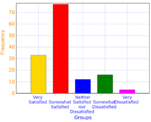
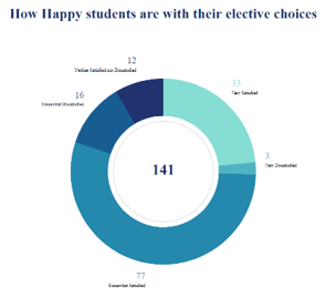
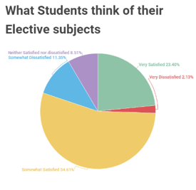
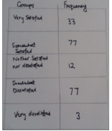
These graphs show the categorical data collected by the year 9 survey for how happy the students were with their elective choices that they were given this year. We have included a two separate pie charts, one with percentages and the other with numbers, a frequency table, and a histogram. The pie graphs show the data collected through sectors , the histogram, the recurrence of the data collected in a more visual way and a frequency table (as you can tell by the name) showing the frequency of the data collected an outlier that is shown through the data in the graph could be the frequency of the somewhat satisfied data collected. This is due to the fact that it’s frequency is significantly higher than all of the other preferences. The most common set of data or mode is the data collected for somewhat satisfied as shown in the histogram it has rocketed above all of the other preferences, although, as mentioned previously, it may be an outlier.
Question for Categorical Data: How satisfied were you with the elective subjects you were given this year?