Reflection of bird’s eye view image:
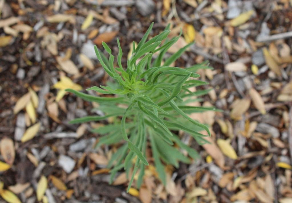
I like that the plant is in focus and the background is blurry. I think it makes the plant stand out. I also like the colours – the brighter green on the plant has a nice contrast with the more autumnal colours on the ground. I think this adds to the image’s overall aesthetic.
Despite that, I think that there are still quite a few improvements that could be added to the photo.
Creativity: The first improvement is with my creativity. This could be added if there were raindrops on the plant, a less distracting background and by having a more colourful plant as the main focus.
Aesthetic: The image’s aesthetic is decent but could be a lot better. There isn’t really a leading line in the photo, but I think it would add sharpness and framing. However, the plant’s “arms” act as semi-leading lines. There is a bit of rule of thirds in the image, with the plant more in the middle third (length-wise) and then the background in the remaining thirds. The background however does distract from the focal point a bit, as it has distracting colours of yellow and browns which takes away from the bright green of the plant.
Skills: My skills in photography still are not very developed since I am very new to it. The bottom of the plant is a bit blurry, but I wanted the background to be completely blurred because it highlights the plant and makes it stand out.
The high angle usually asserts dominance and shows what is imaged as being ‘less than’, small, fragile and weak. In this instance, the plant can be viewed as under attack from something – for example humans/climate change against the environment. It causes us to deem the plant as fragile and vulnerable to the bigger source.

Reflection on worm’s eye view image:
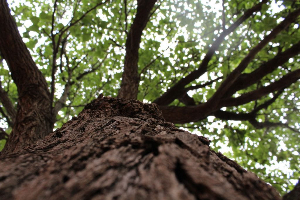
I like that you can see the texture of the tree bark close up in the image, as well as the colours of the brown trunk and green leaves in the background, because I feel as though it adds to the overall aesthetic. The tree trunk is sort of a leading line in the image but not a very obvious one.
Improvements-
Creativity: The photo isn’t very creative. I think that having a less over exposed background and rain drops/rain could make the image much more creative and appealing.
Aesthetics: The tree trunk acts as a semi-leading line but would be better if it was in the middle of the image and had a direct focus to the top of the tree and leaves. I could’ve improved the rule of thirds by having the trunk in the middle and bottom third of the photo, and then the branches acting as leading lines out of the third and into the remaining space.
Skills: The background behind the leaves is a bit over exposed which takes away from the leaves’ colour and aesthetic. The bottom of the tree trunk is also slightly too blurry since I was trying to make it the focused part of the image, with the rest of the tree blurry.
The low angle frames the tree as being more dominant, stronger and powerful. In this instance, it could be related to the real world as the tree is a strong built structure that provides the earth with many benefits, therefore conveying the idea that it is important.

Recent Comments