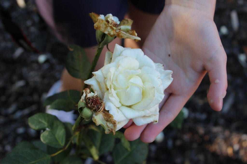
My capturing kindness photos explores the concept in a slightly less generic way. Instead of picturing an elderly and young person doing some sort of activity together, I decided to show the kindness in a different way. This image shows kindness from people towards nature.
what worked:
I like how the flower is the center focus and how the hand is holding and caring for it. The flower’s colour stands out but also works with the background colours of dark green and browns. I think the image is overall reasonably creative since it isn’t the usual elderly and young, but it could’ve been improved. The fact that the flower is pictured being held next to the dead flowers can be interpreted as people protecting the earth as it is vulnerable and dying.
what could be improved:
I think there is quite a lot that can be improved. The flower would’ve been more aesthetic to look at and would’ve stood out more if there weren’t dead flowers beside it. It also isn’t very centered. You can see the shoes and uniform of the person holding the flower, which draws attention away from the main focus. It also would’ve been more aesthetic if there was a more neutral background (the person and ranges of colour takes away from the piece) and the flower stem was in the middle, not pointing to one side.

Recent Comments