Forced perspective

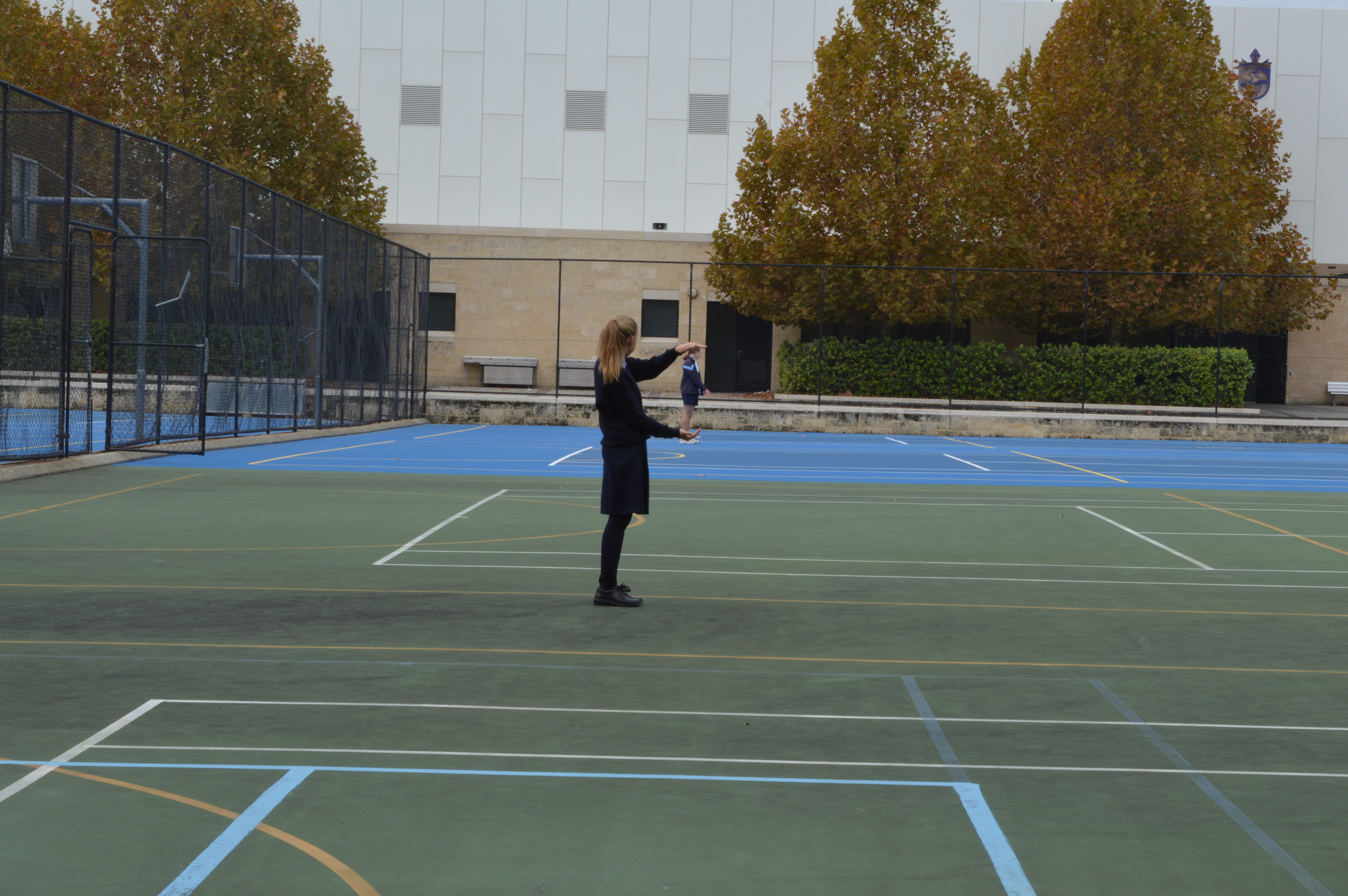
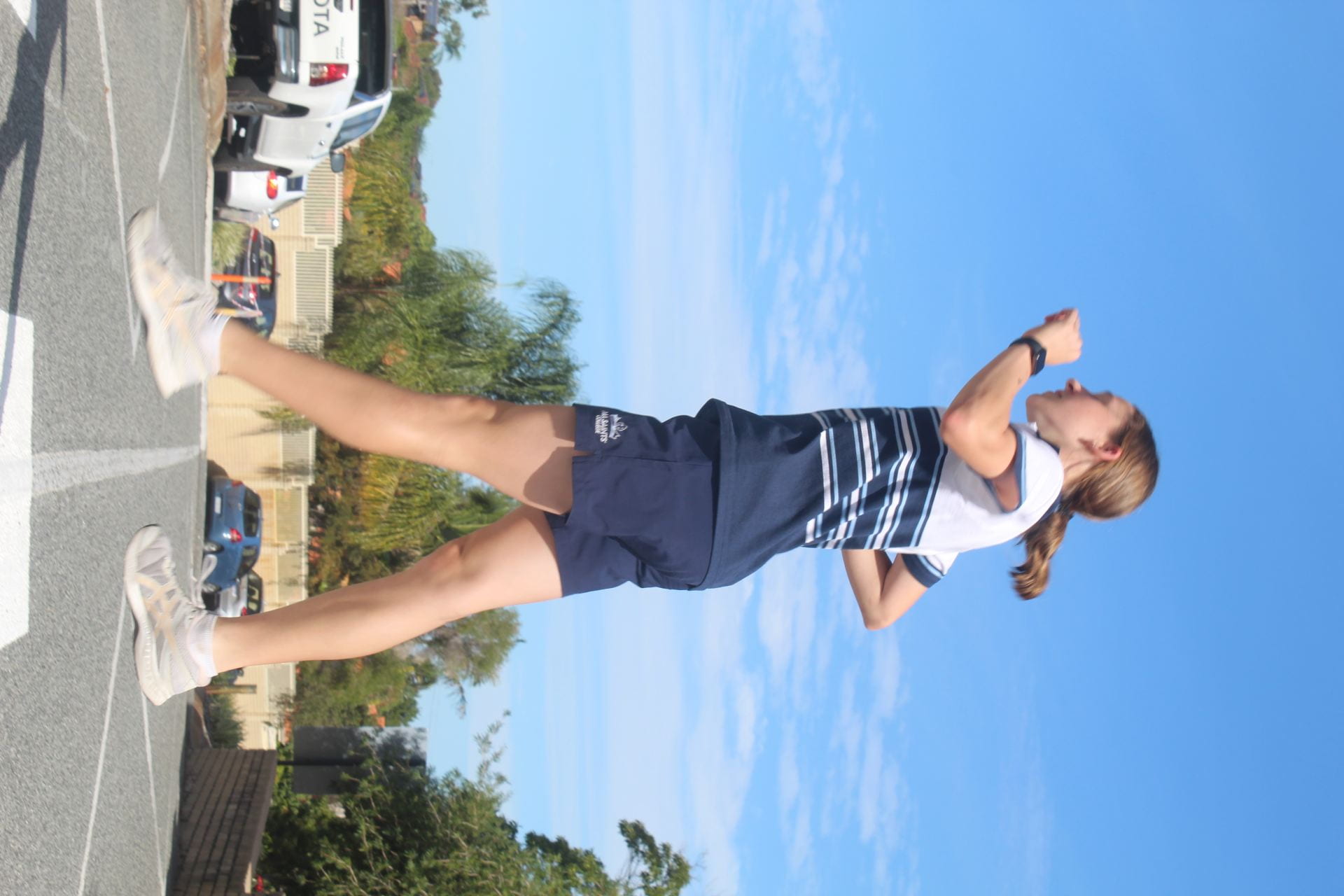
In the forced perspective images we set a large depth of field and attempted to make creative images using how close everyone was standing to the camera.

WWW: I do like how since I am standing further back it looks like keira is holding me in her hands. I think it makes the image somewhat creative.

Improvements: I think the image could’ve been more creative if there were costumes and it was photographed in a more aesthetic place. The background is distracting since it has different colours, lines, trees and buildings, which all takes away from the focus and clutters it. The lighting also could have been improved if we changed the ISO since it is quite a dark/gloomy image/lighting. Leading lines and more rule of thirds would’ve made this image a lot more appealing and overall better and would’ve created a more centred focus on us.

Toy photography

WWW: I think the image is relatively creative with the guy sitting on the flower. I like the colour contrasts of the flower and the person. It has a small depth of field which I think makes the image more appealing and emphasizes the focus on the small character.

Improvements: I think the flower is a bit brown and dying in places which can be seen as taking away from the image aesthetic or can be seen as adding to a storyline of the image. Leading lines would’ve made the image look more appealing and drawn the viewers eyes to the centre person too. The background of the image is a bit busy and distracts from the focus of the person and flower.

The toy photography photos I got definitely are not great but they have some okay things about them.

WWW:

I like the height progression of the animals in the image and them facing different ways kind of makes a rule of third. I also like the different elevation of the sand pile which I guess in a way makes it look like a natural habitat.

Improvements:

Everything else in the image was not great. There wasn’t any leading lines in the image which would’ve made it more interesting and would’ve drawn people’s eyes to the image. There are shadows on the sheep from poor lighting which took away from the aesthetic aspect. There also could’ve been a creative backstory but this photo doesn’t have one. I feel like it also needs some sort of additional colour to make the image look more aesthetic.

Light graffiti

In the light graffiti images we had to use adjusted shutter speeds and lights in the dark to create patterns or image effects.

What went well:

I like how the dark background and coloured light pattern next to my face makes my eye become lit up and a focus in the image. The light colour of my eye compared to the light pattern also works well since they are different yet kind of compliment each other. The pattern of the light by my face is made to look like flames or fire and follows my face shape, which I think adds to the images creativity and effect.

What could’ve been improved:

My eye could have been in a bit more focus since it is a bit blurred which takes away from the quality and focus. My mask also has writing on the side of my face that has been focused and lit up, which is slightly distracting but overall not too noticeable. The image’s creativity could’ve been improved with maybe a different pattern around the face, but I think it is still decent in creativity.

Levitation photos

In the levitation photos we had to try take images where we look like we were doing regular activities, but while in the air/jumping to make it look as if we were “levitating”

the image wouldn’t turn

What went well:

The image has good lighting and leading lines, with the line following through the middle of the pedestrian crossing and the middle of my legs, which draws your eyes to the focus person and splits the image in a way. I think I look relatively levitated but that could be improved on.

What could be improved:

The background of the image (mainly the cars and fence) is a bit busy and distracting, taking away from the main focus and adding colours into the mix that don’t really match. My feet are a bit blurred and I look a bit stiff which makes it look unnatural and not really levitating. It is sort of creative but would have been better if we had a costume or if we photographed on a cloudy day, I could’ve been crossing with an umbrella (a certain colour to add to the image), a newspaper and a raincoat.